This application allows users to create templates and presentations, which can be used within playlists or interactive presentations published to an nfinityX media device. Create single page dynamic presentations that allow you to connect to live data feeds. This is very useful for menus, business information and airport flight information screens. The XID user interface presents the user with a set of controls allowing him/her to create engaging visual presentations.
The XID interface has three sections
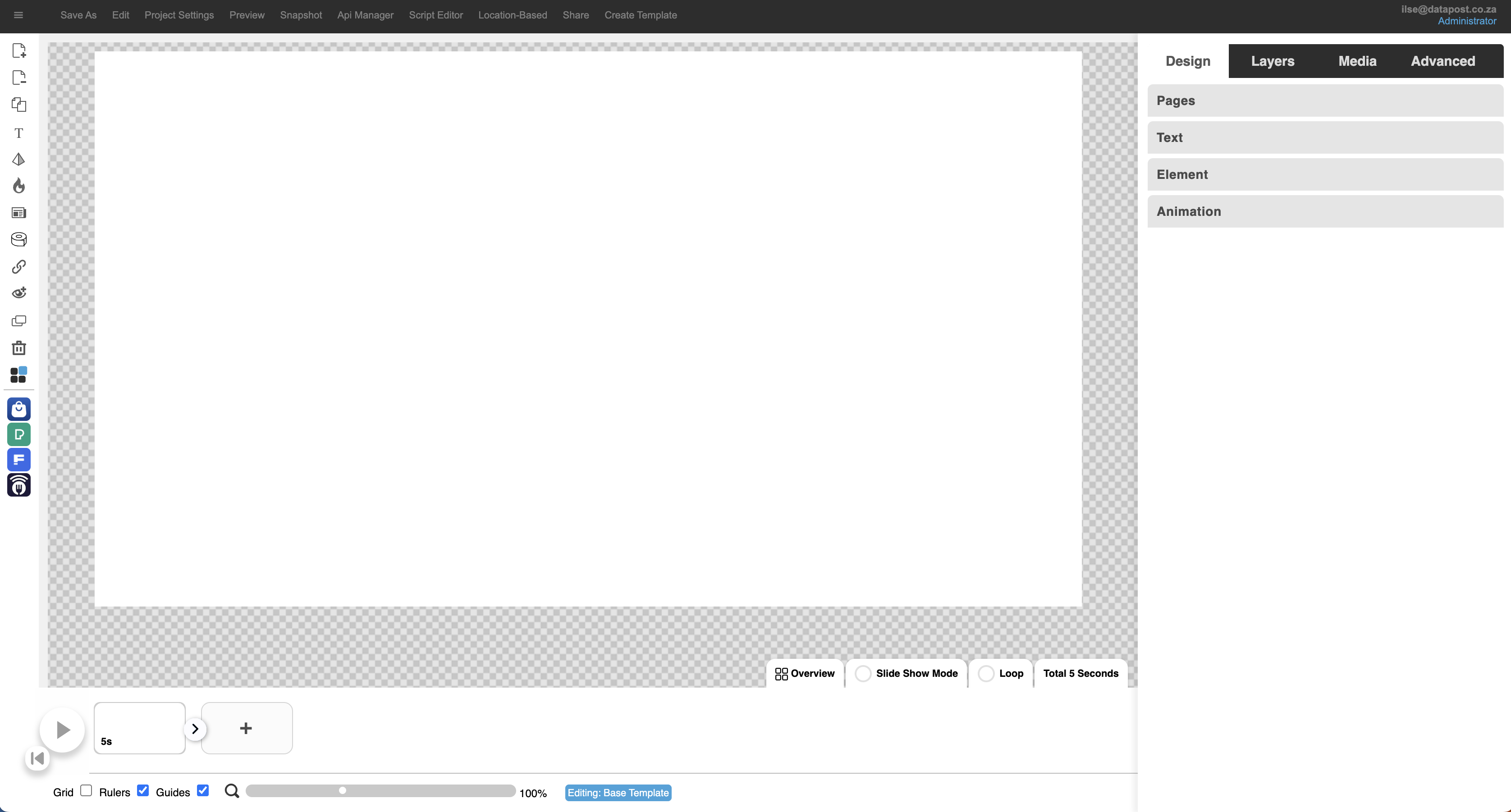
1. Horizontal Menu Bar
1.1 Project Name
Once you have saved your XID project, the project name will display in the top left corner of the screen.
1.2 Save As & Save
When you create your project, you will save it as the title you want to give it. The next time you open it, the Save button will appear for you to simply save your changes.
1.3 Edit
The edit menu offers the user the convenience of the following actions Undo, Redo, Cut, Copy, Paste, Stretch, Crop, Duplicate and Delete.
1.4 Project Settings
Select the aspect ratio, you require your XID project to be, from the drop-down menu. Your options are 16:9, 9:16 and 4:4. The aspect ratio can also be customized. Projects can be renamed or deleted from this window as well.
1.5 Preview
Clicking on preview allows you to view your design. You are also able to test your interactive projects by navigating through your customer journey.
1.6 Snapshot
This allows you to capture a snapshot of your page design.
1.7 Api Manager
The Api Manager enables the user to attach live data to the project. This can be done via Google Sheets, json files or REST API’s.
1.8 Script Editor
This is where you would go to add and edit custom Javascript scripts.
1.9 Location-based
When you click on Location-based, a window will open. This is where you will set up locations that are used for dynamic text.
1.10 Share
Share the project that you are working on with other users by making them project owners.
1.11 Create Template
Create a template and publish it to the XID Store.
2. Toolbars (Left panel)
Add Page
Click on the Add Page button to create a new page.
Remove page
Click on the Remove Page button to delete a page.
duplicate page
Click on the Duplicate Page button to create a copy of a page.
ADD TEXT
Click on the Add Text button to add text to a page.
ADD SHAPES
Click on the pyramid icon to add shapes to your presentation.
2.1 How to add a page

1. Click on the Add Page icon at the top of the toolbar on the left.
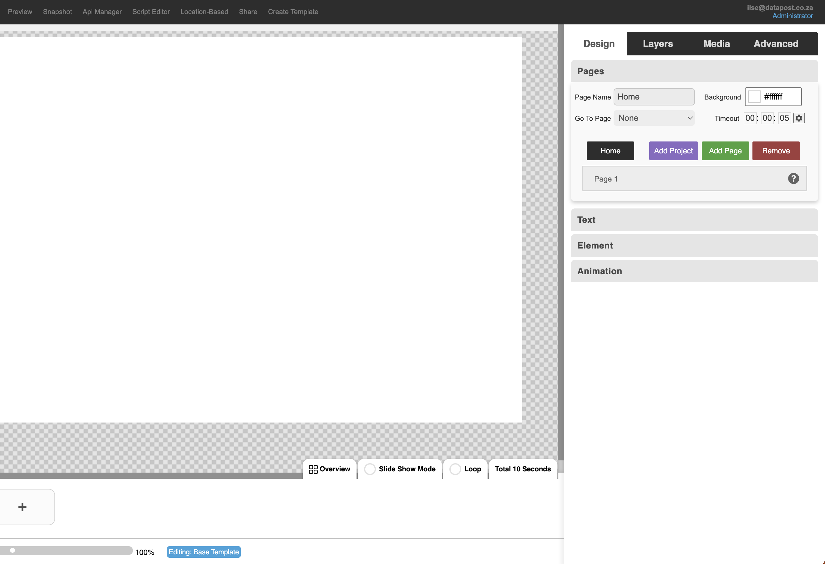
2. The added page will appear under Pages.
2.2 How to remove a page
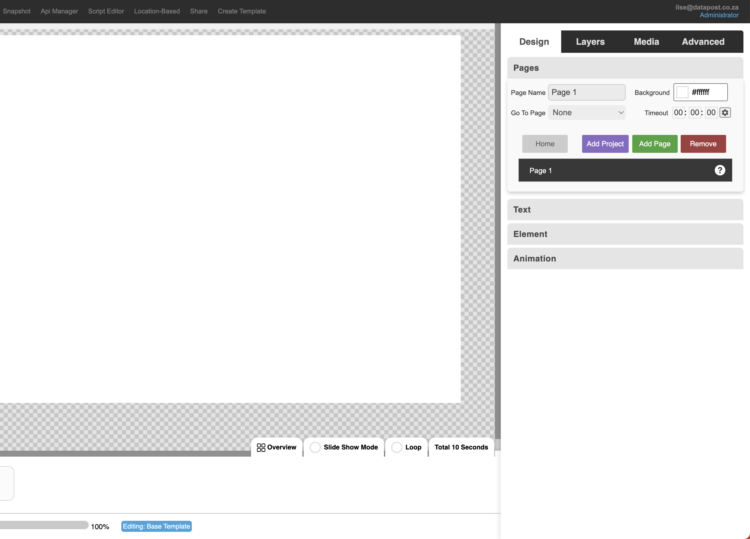
1. Remove a page by clicking on the it in the panel on the right. Followed by either the red Remove button in the panel or the Remove Page icon in the toolbar on the left.
2.3 How to duplicate a page

1. Highlight the page that you want to duplicate by clicking on it in the panel on the right.
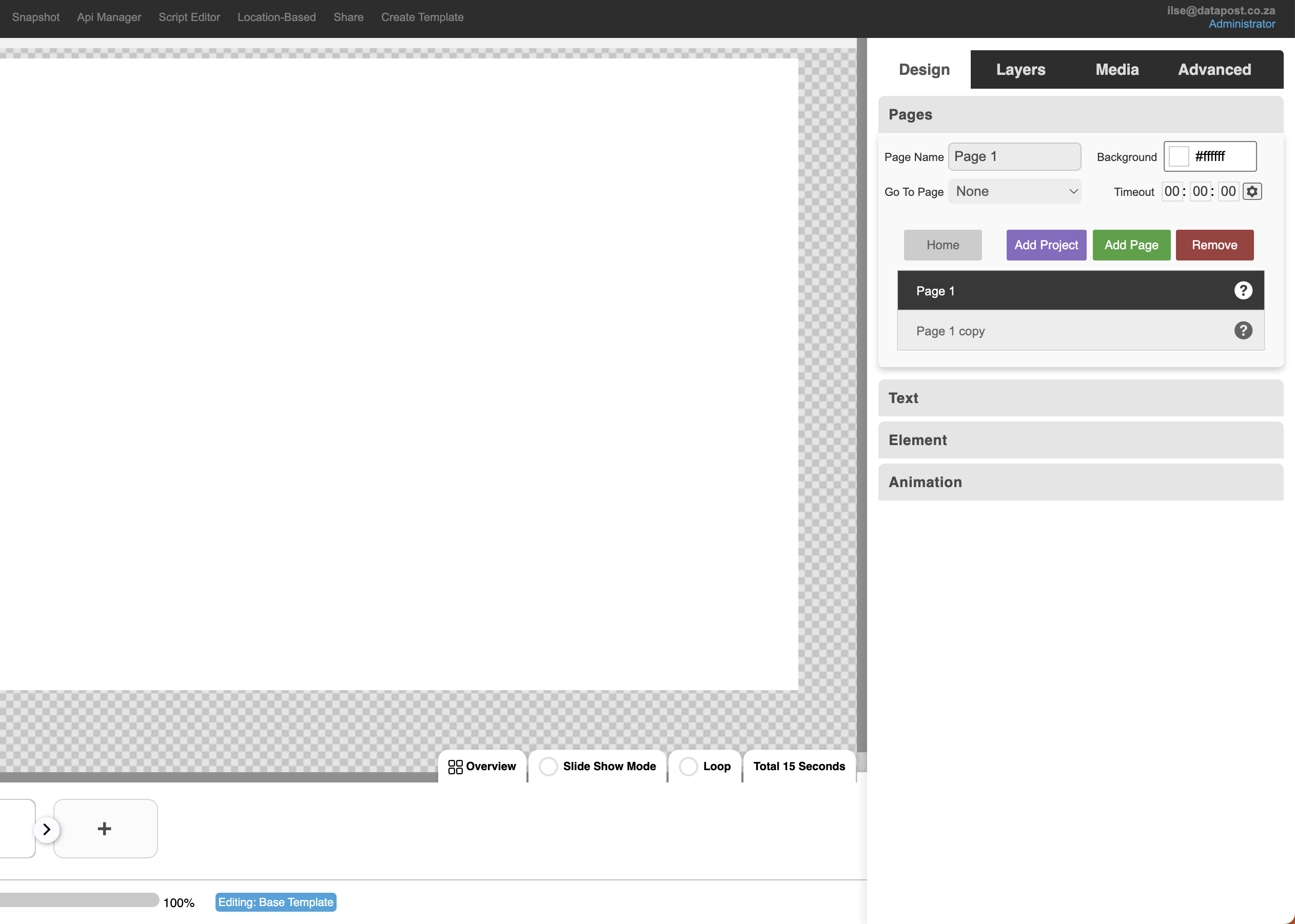
2. The duplicate of your page will appear below the original page.
2.4 How to add text
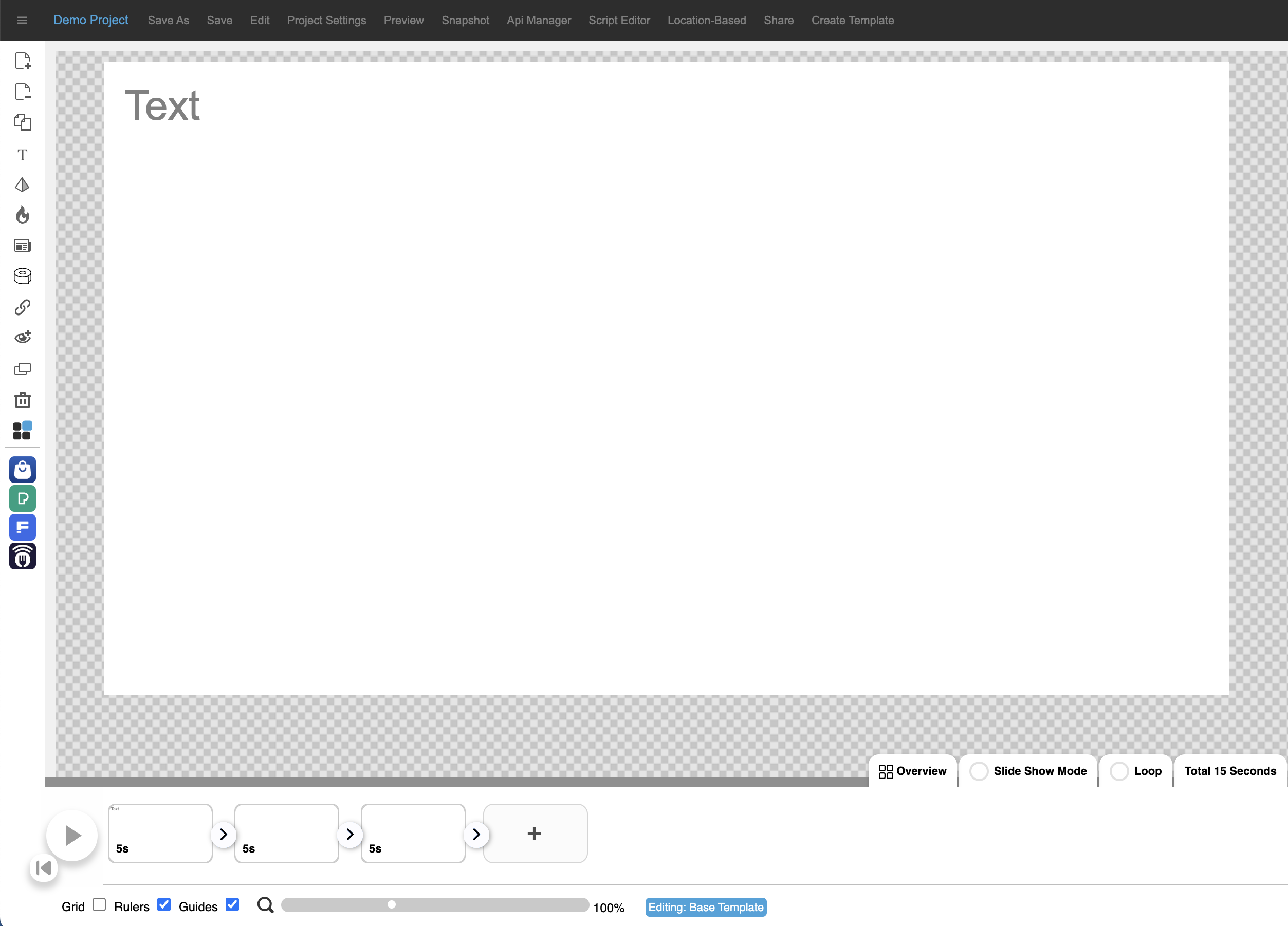
1. Click on the Text icon in the menu bar on the left. A default text block will be inserted on the canvas.
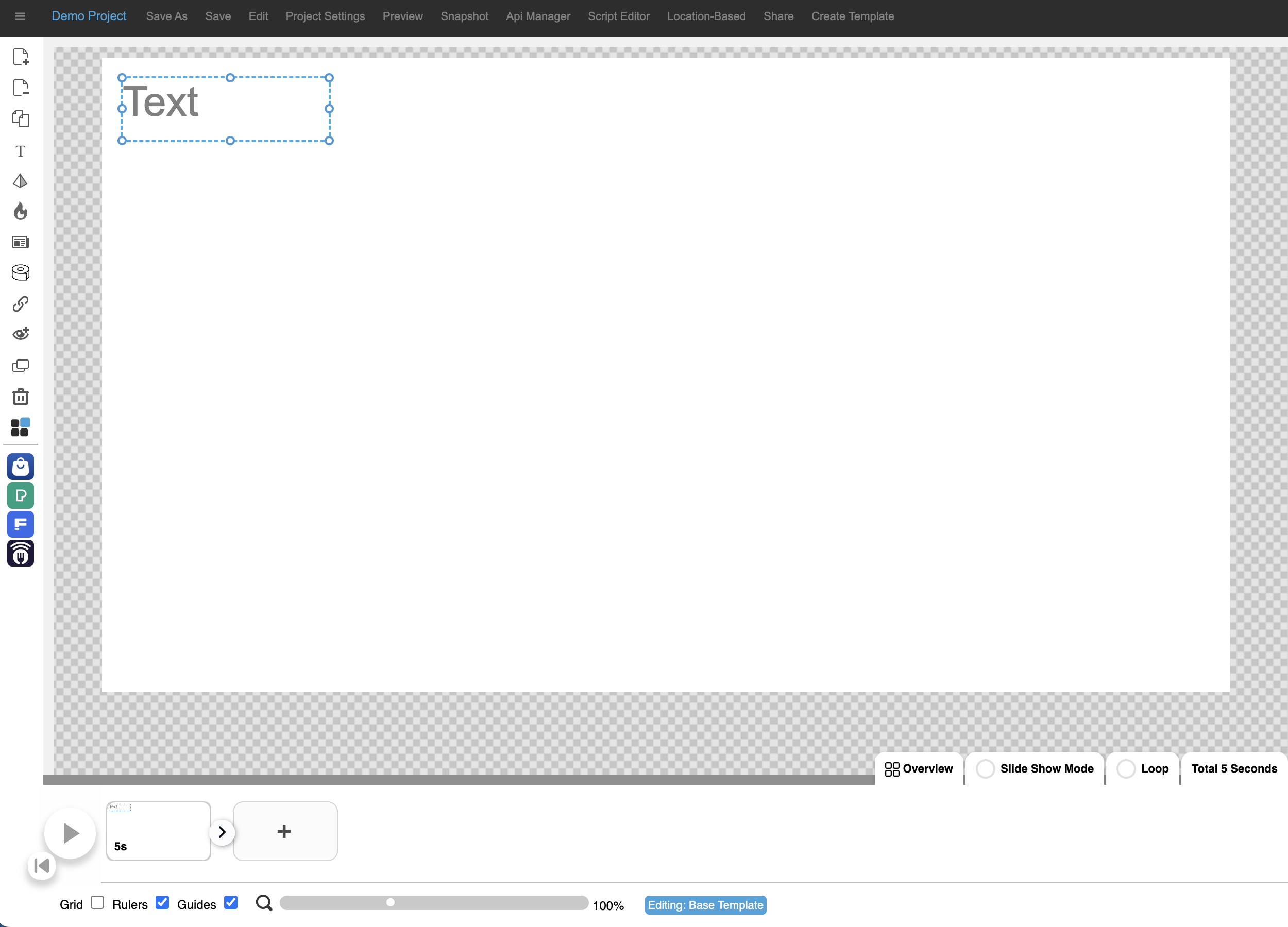
2. Click on the text box to ensure that it is highlighted.
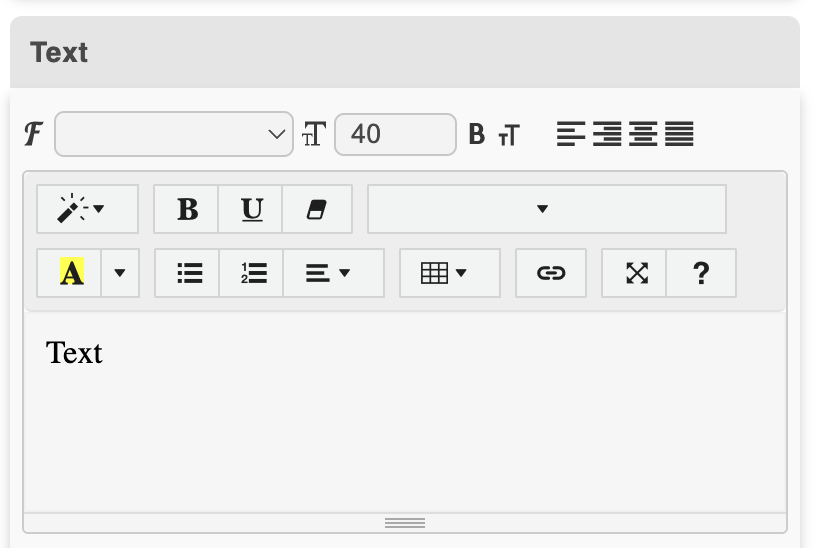
3. Edit the text by typing in the block.
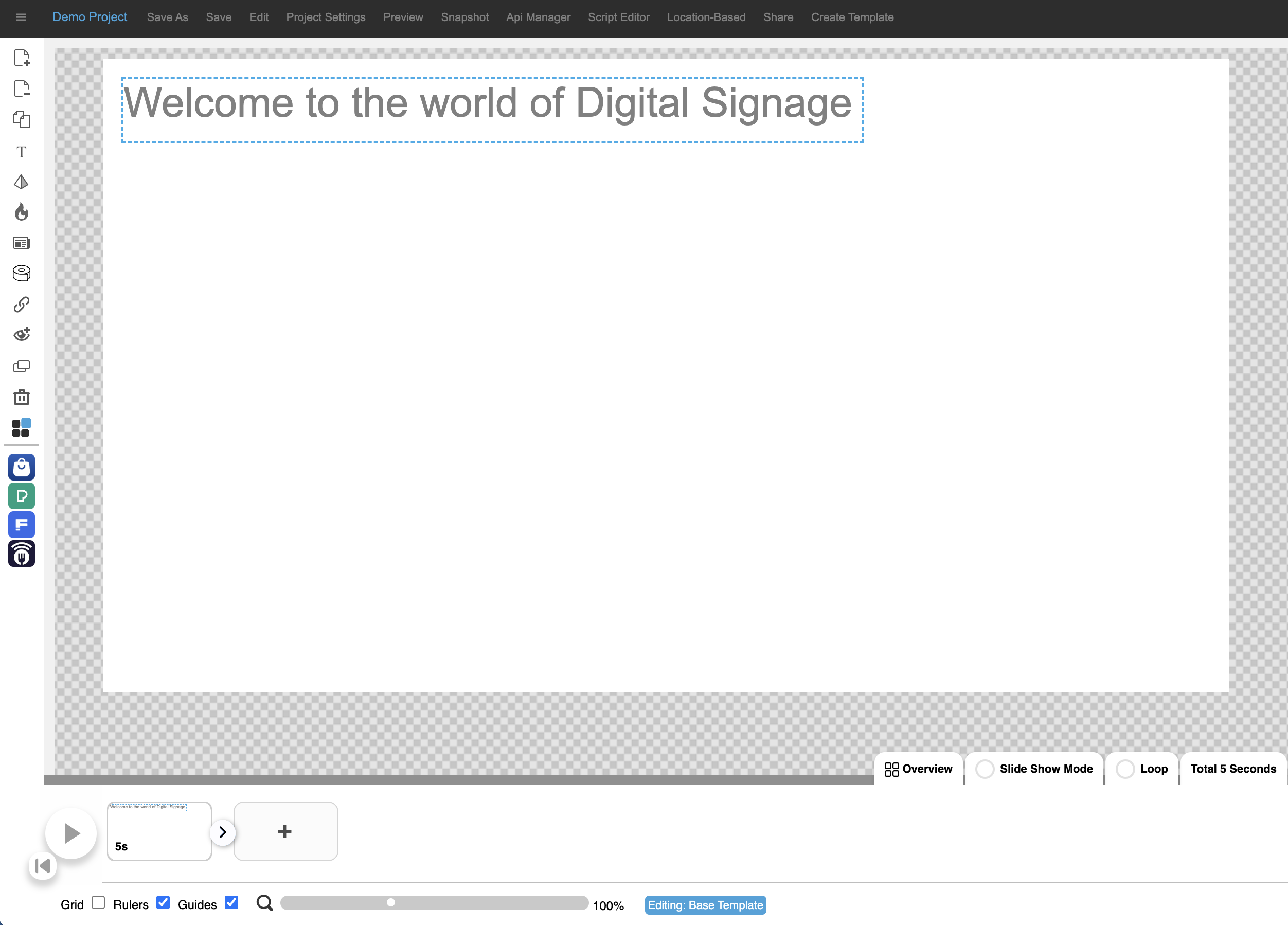
4. The text will update on the canvas. You will have to expand the binding box to make the text fit.
2.5 How to add shapes

1. Click on the pyramid icon in the menu bar on the left.
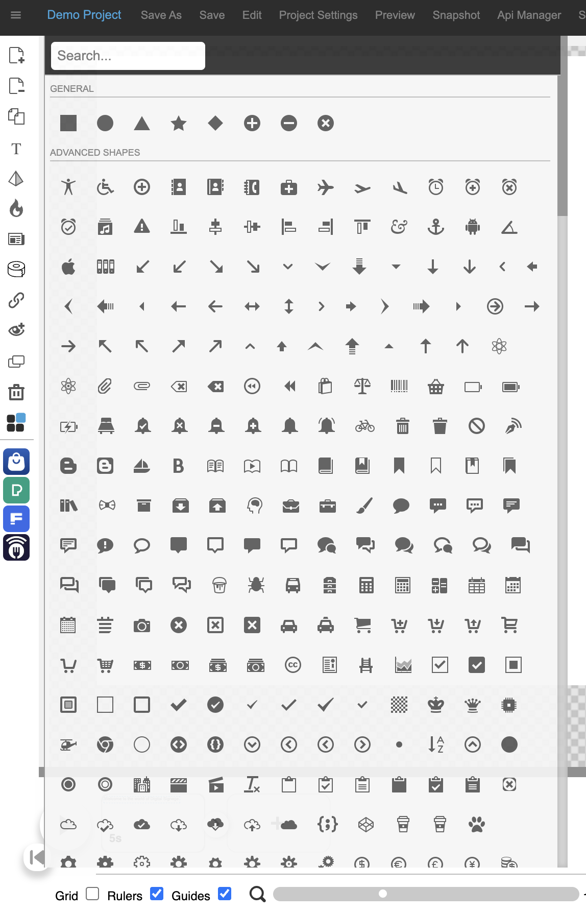
2. A list of shapes will appear. Click on the relevant one.
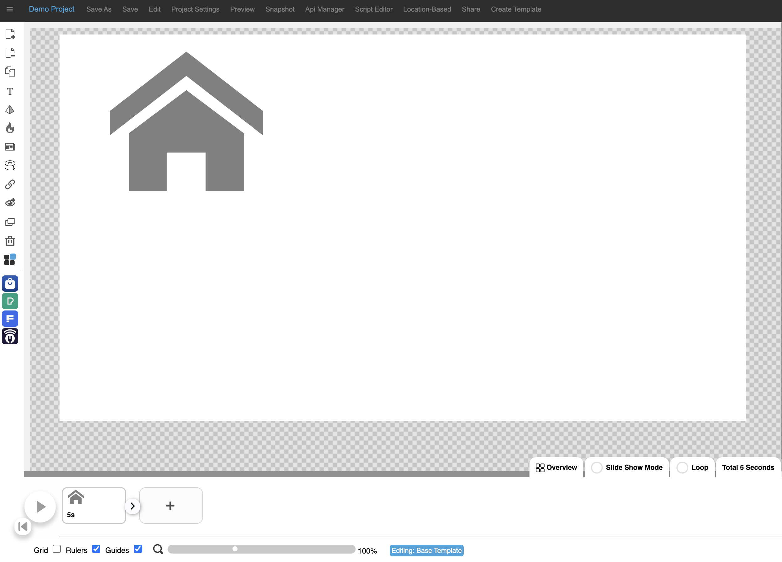
3. The shape will be inserted on the canvas.
HOTSPOTS
Add a Hotspot (transparent overlay) to your project by clicking on the flame icon.
ADD A WEBPAGE
Click on Add a Webpage to add a web component using a URL. It is important to note that the site needs to allow CORS.

TICKER
Add animated text or an image feed to your project.
INTERACTIVE MODE
Create interactive presentations allowing users to navigate to different pages in the presentation by using Interactive Mode.
ADD IMAGE MODAL
Click on Add Image Modal to add further information to screens.
2.6 How to add a hotspot
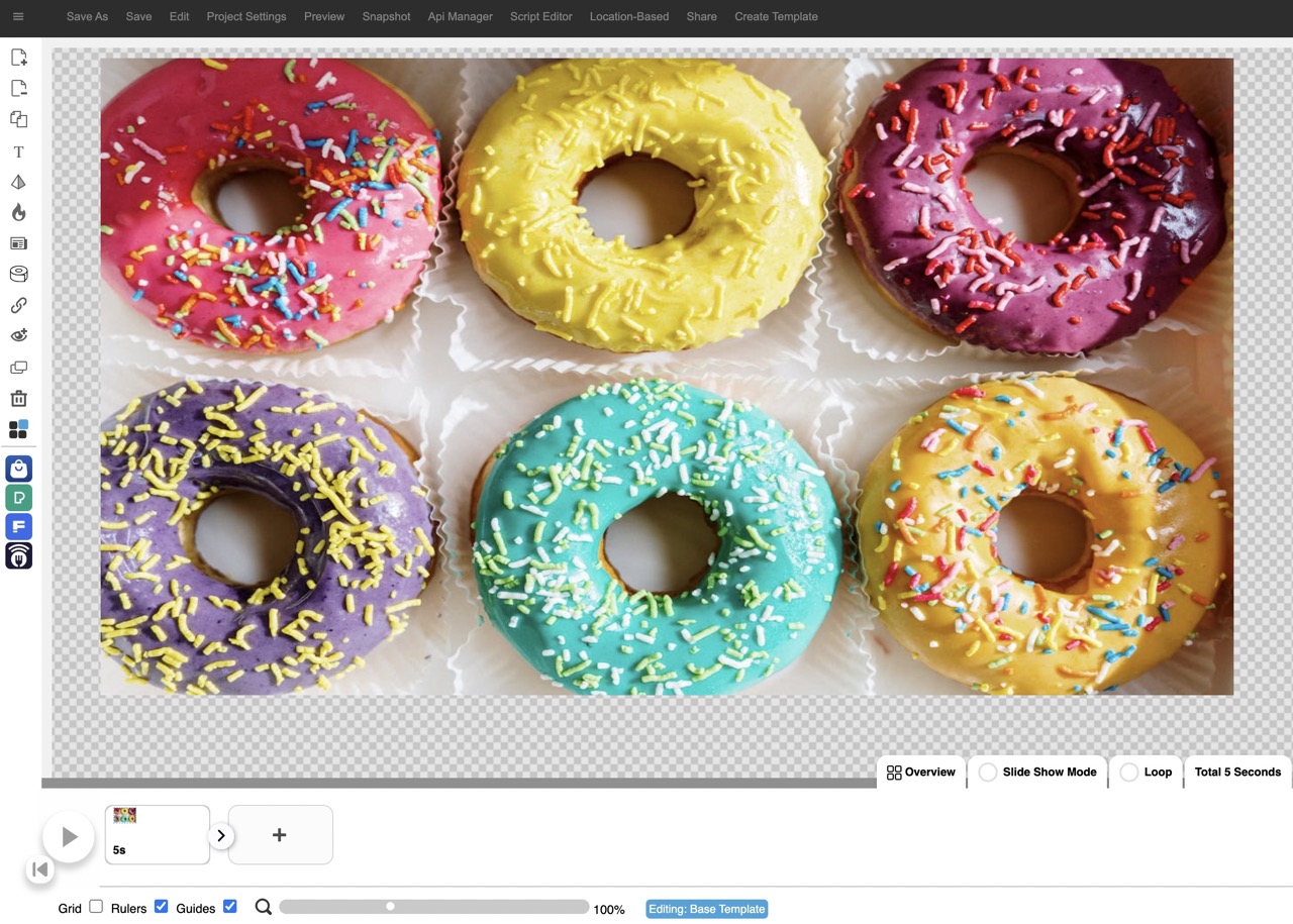
1. Hotspots are used to add navigation to interactive projects.
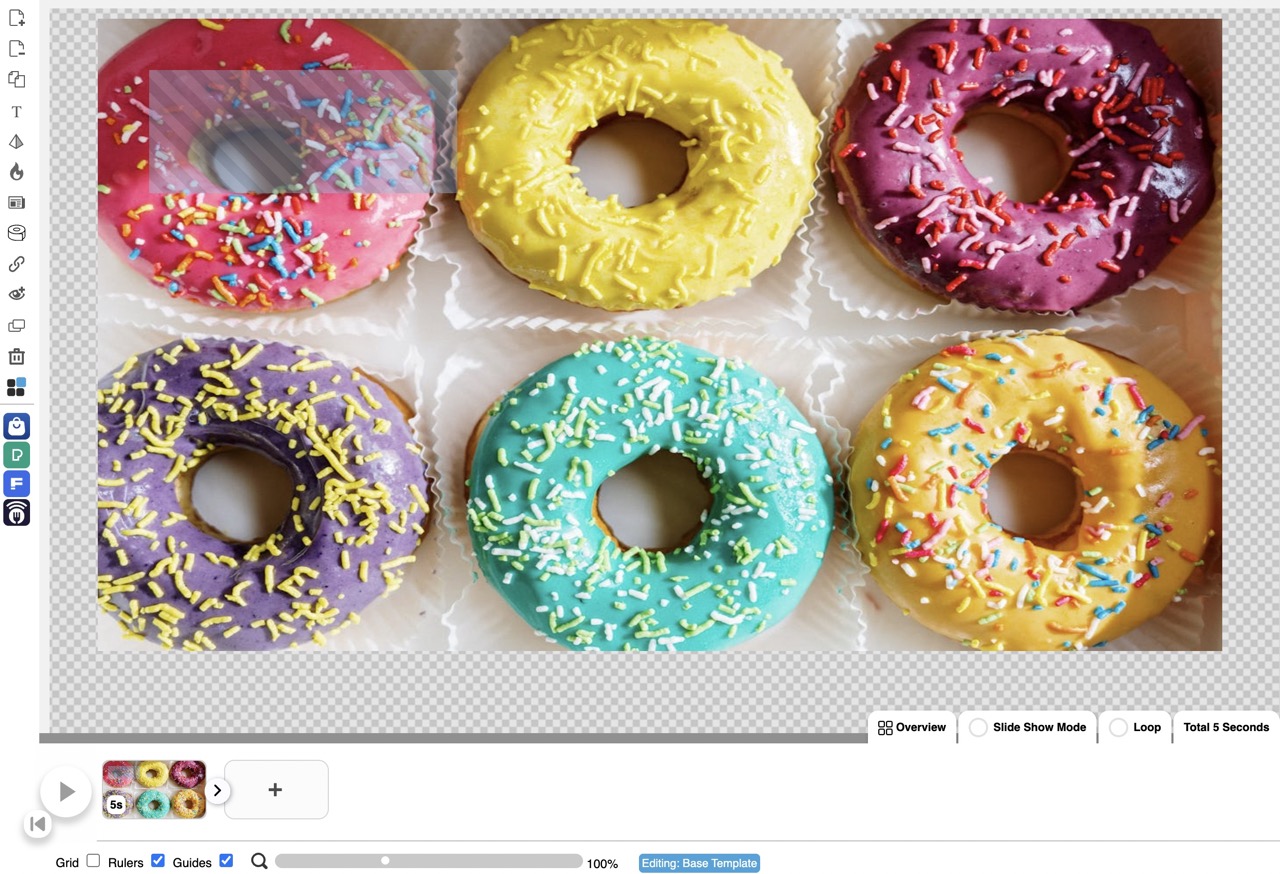
2. Click on the flame icon in the menu panel on the left. A hotspot will be inserted on the canvas.
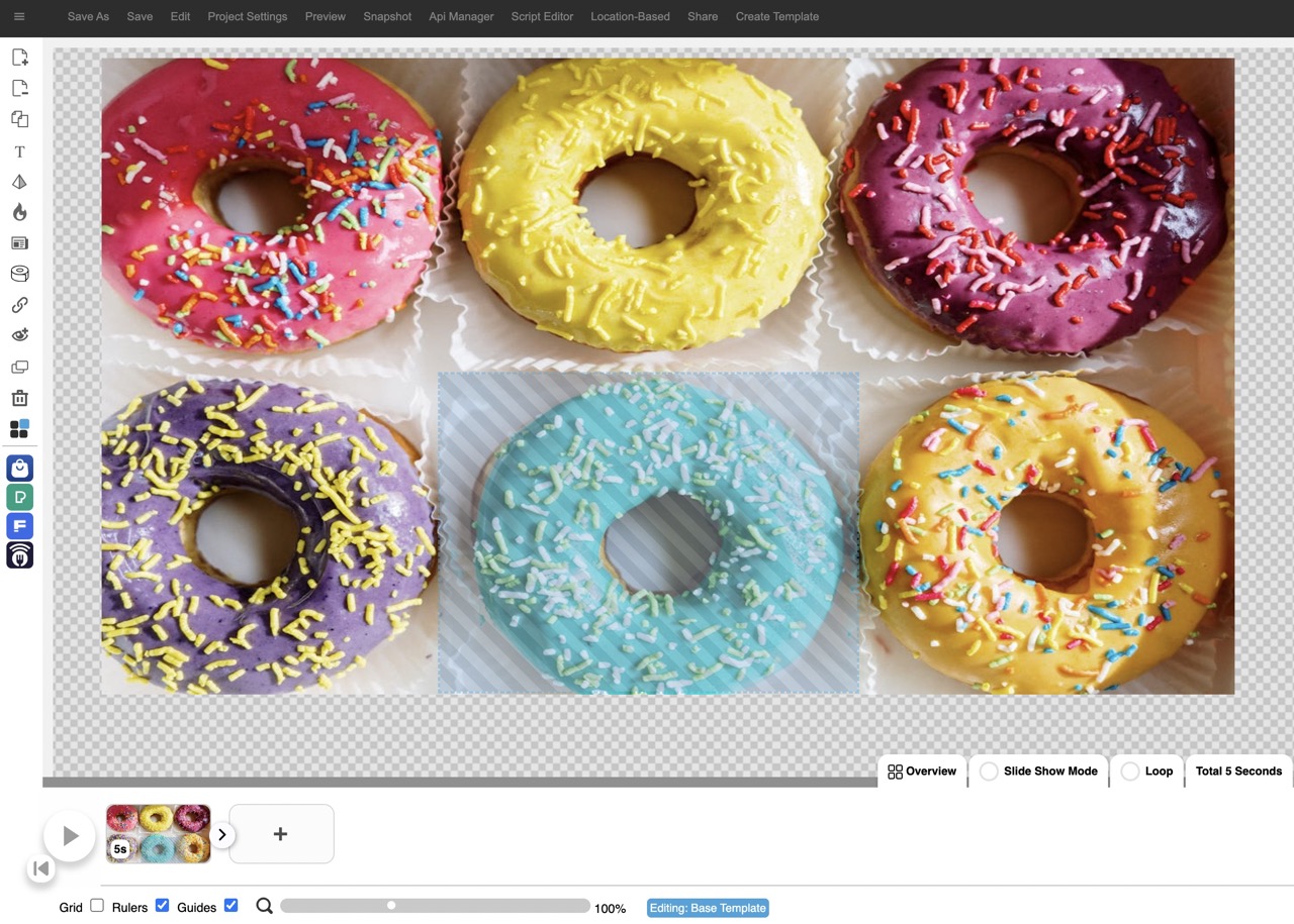
3. Drag the hotspot across to the relevant spot on the canvas and resize by dragging the corners.
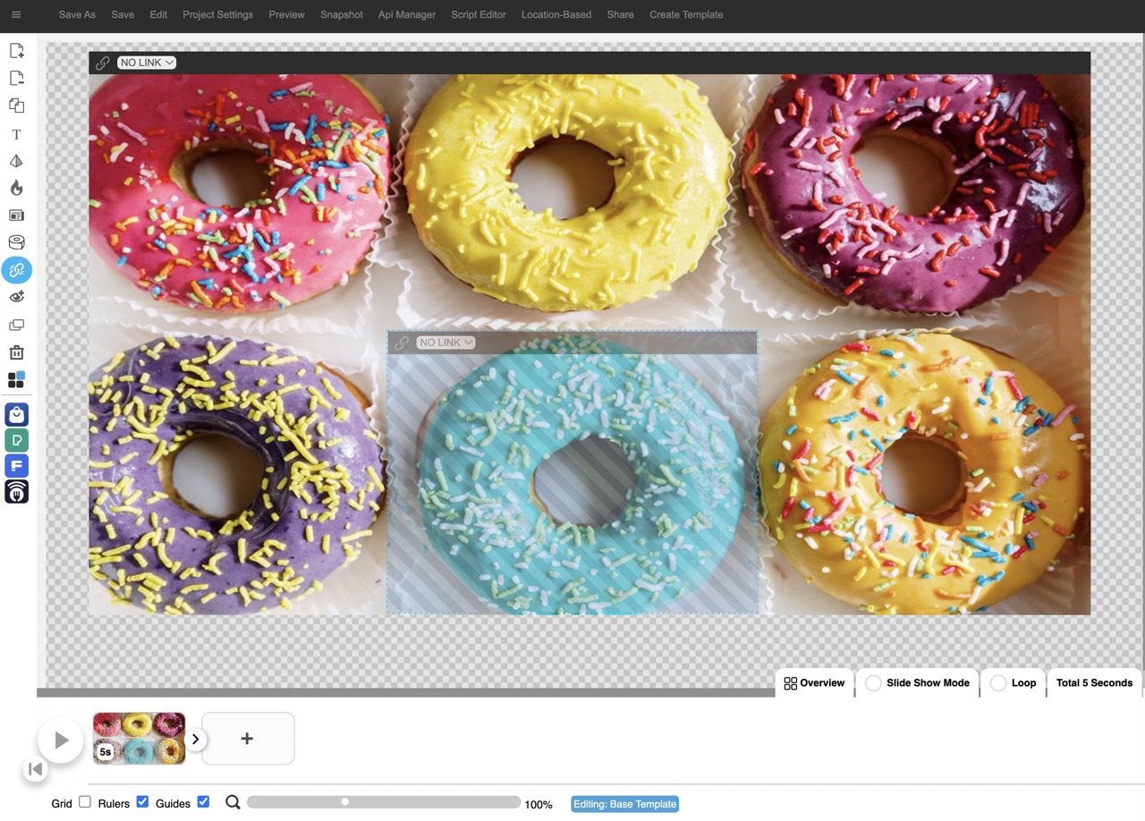
4. Click on the Interactive Mode icon in the menu panel on the left. Select the page, you want to link the hotspot to, from the drop-down.
2.7 How to add a webpage

1. Click on Add webpage icon in the menu panel on the left.
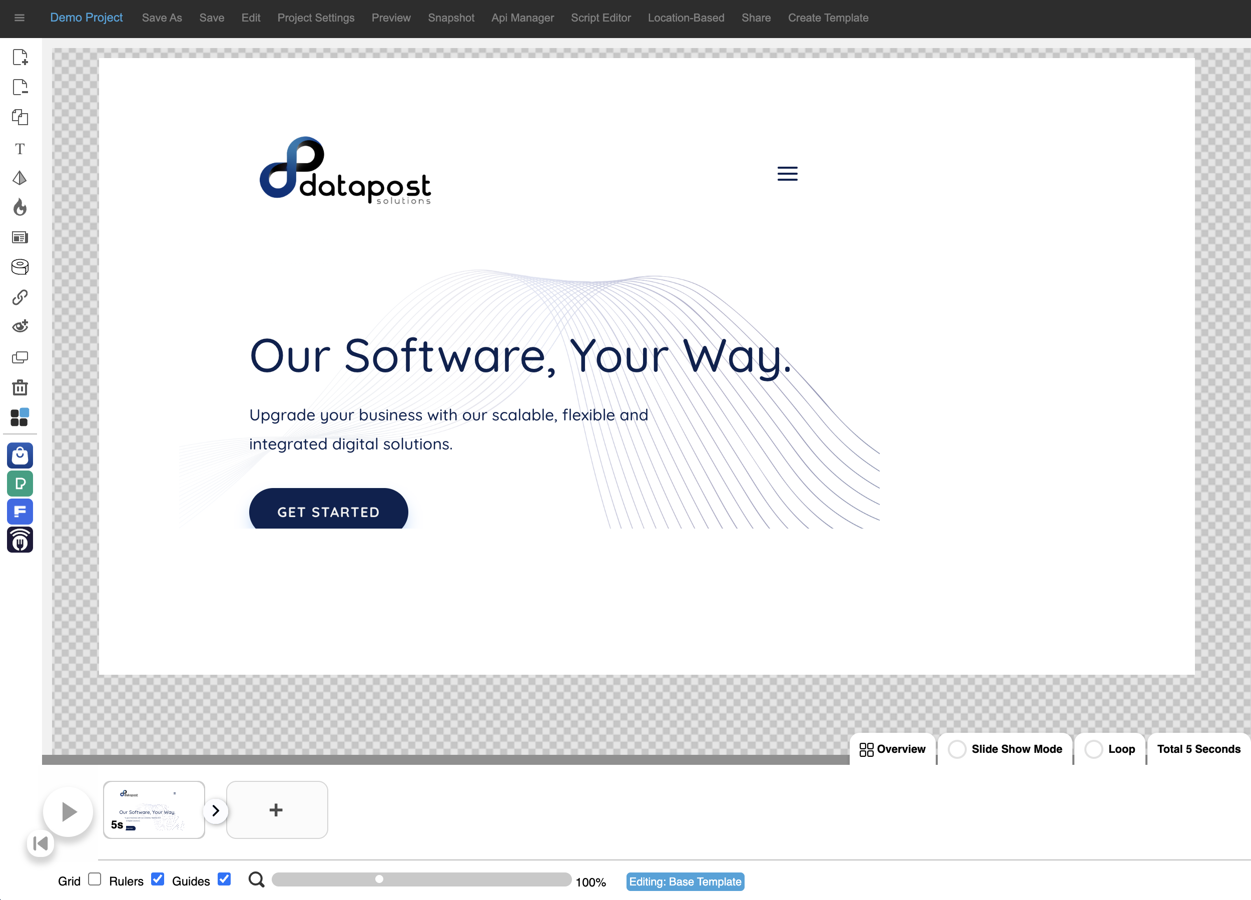
2. The Datapost website will appear on the canvas.
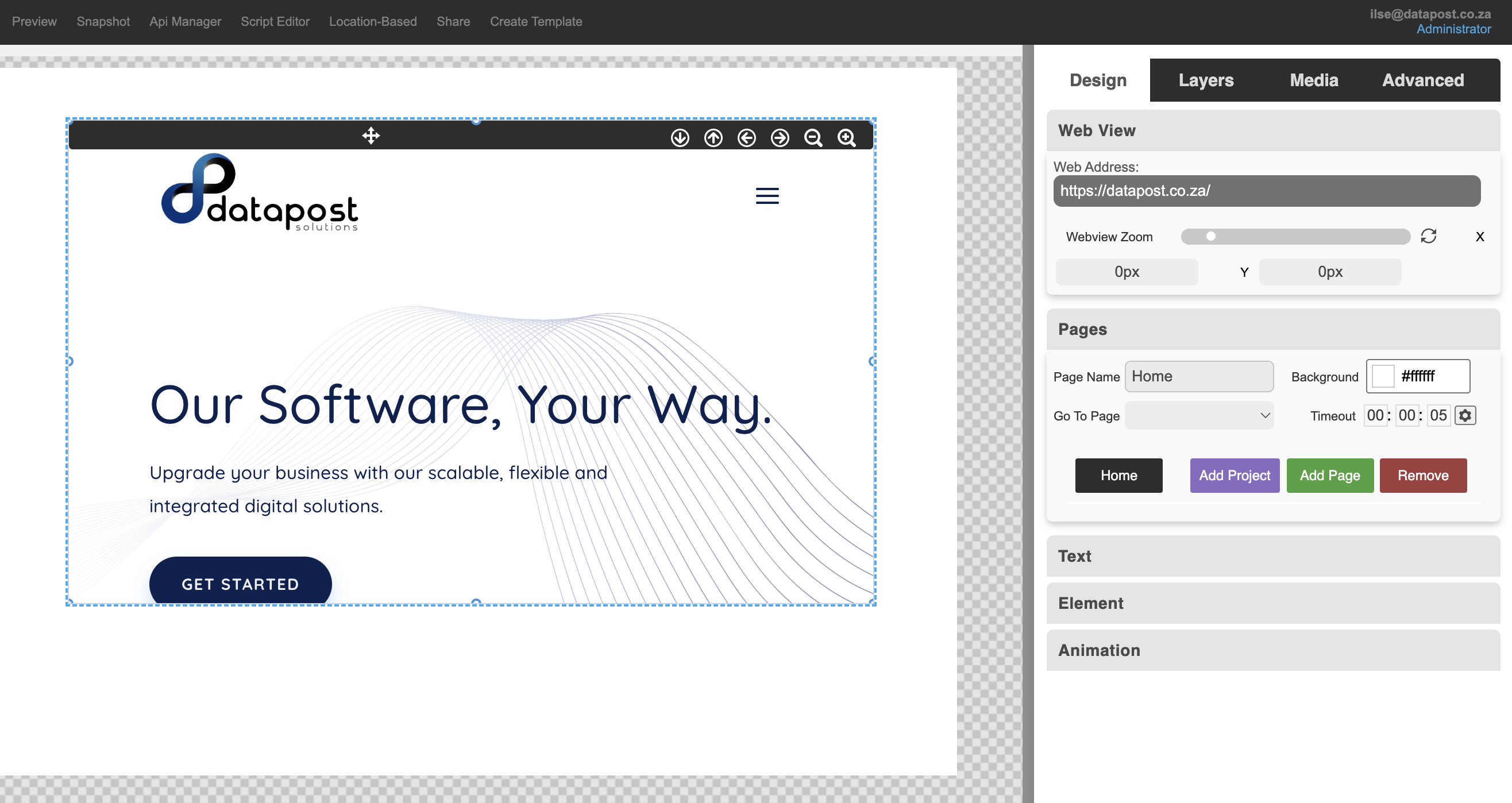
3. Click on the black bar of the web page. The Web View panel will open. This is where you will change the web address to the required one.
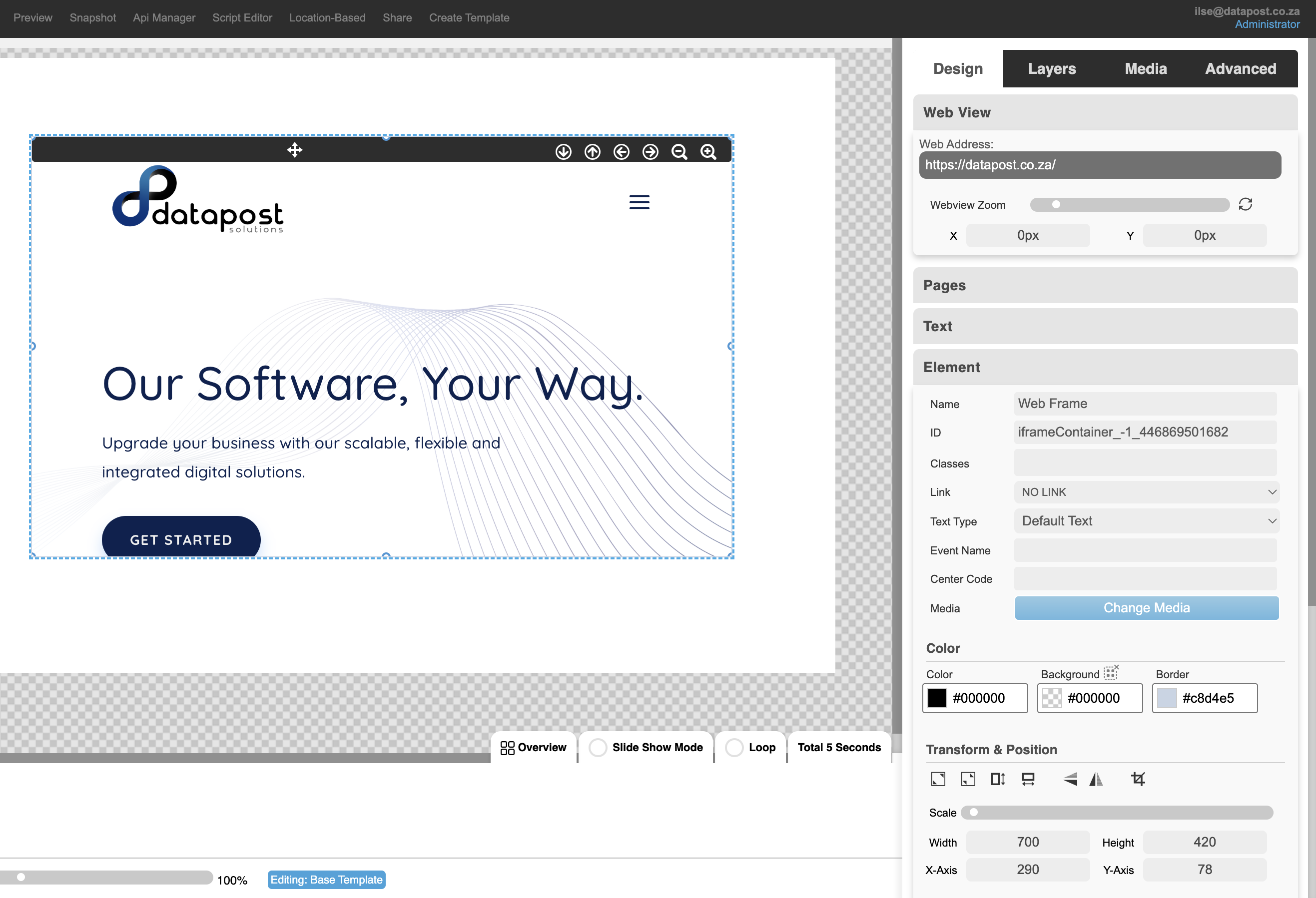
4. Open the Elements panel and click on the Stretch to Fill tool under Transform & Position to fill the canvas.
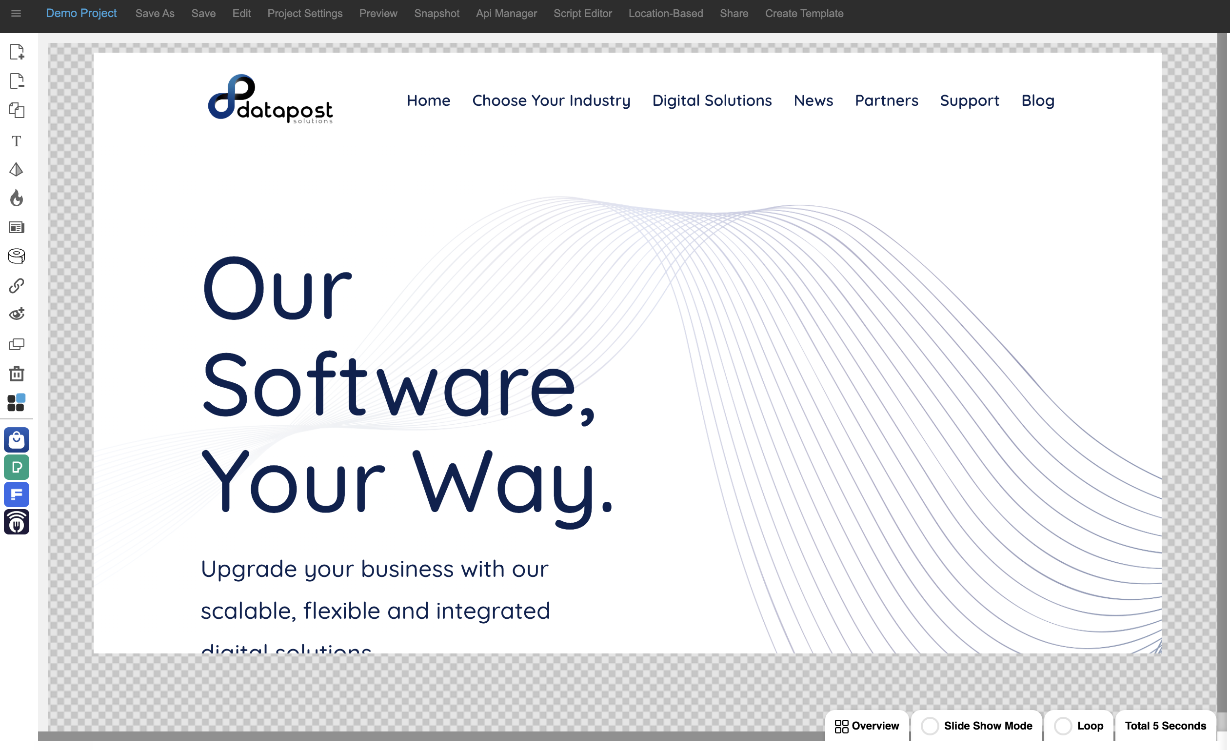
5. The web page will expand.
2.8 How to add a ticker

1. Click on the Ticker icon in the menu panel on the left.
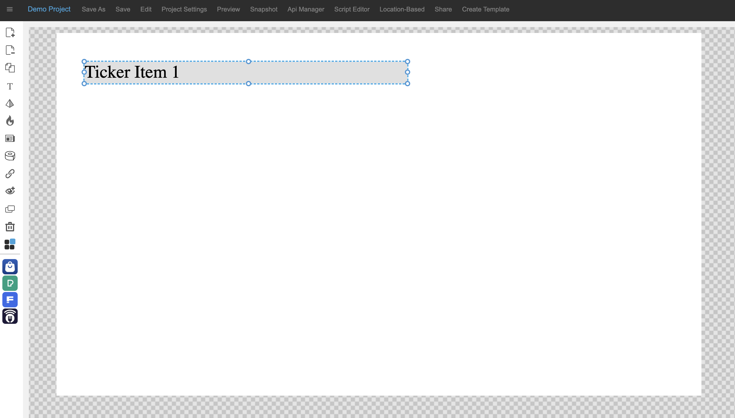
2. A ticker item will be inserted on the canvas.
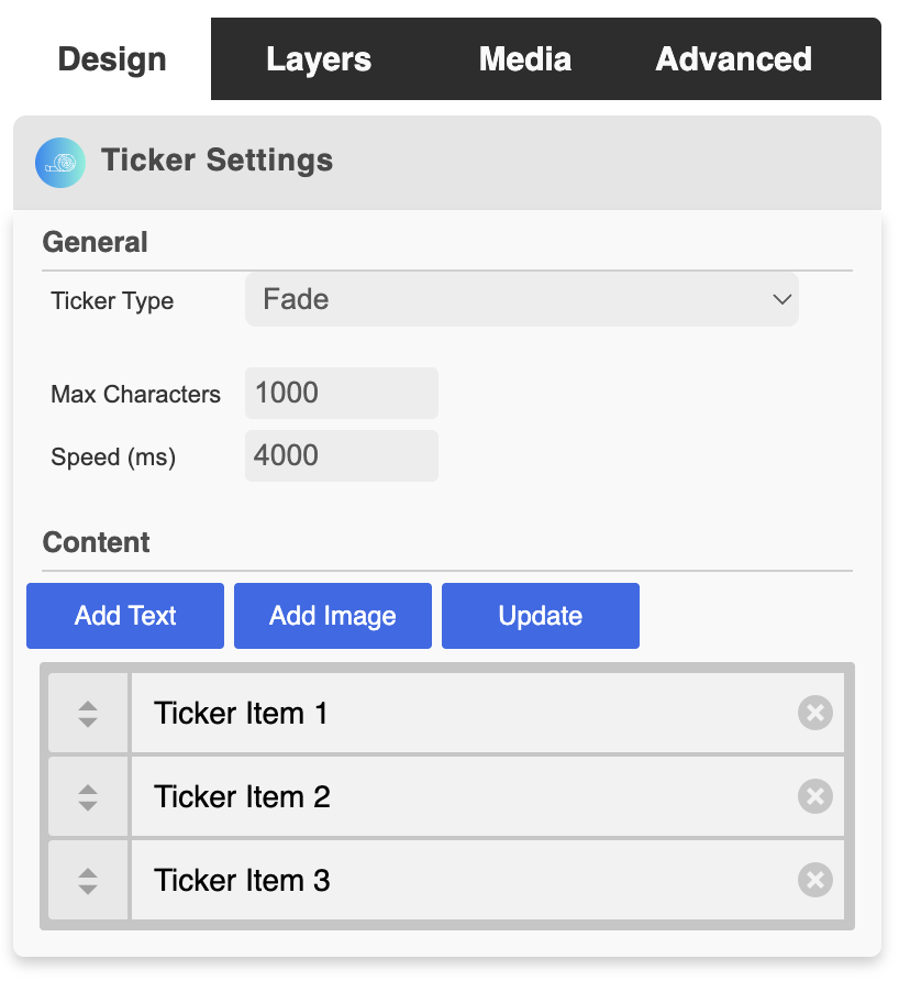
3. The Ticker Settings panel will open.
There are 3 ticker types: fade, vertical-up & vertical-down.
The maximum number of characters can be set by inputting the required number.
The speed of the ticker animation can be set by inputting the required speed.
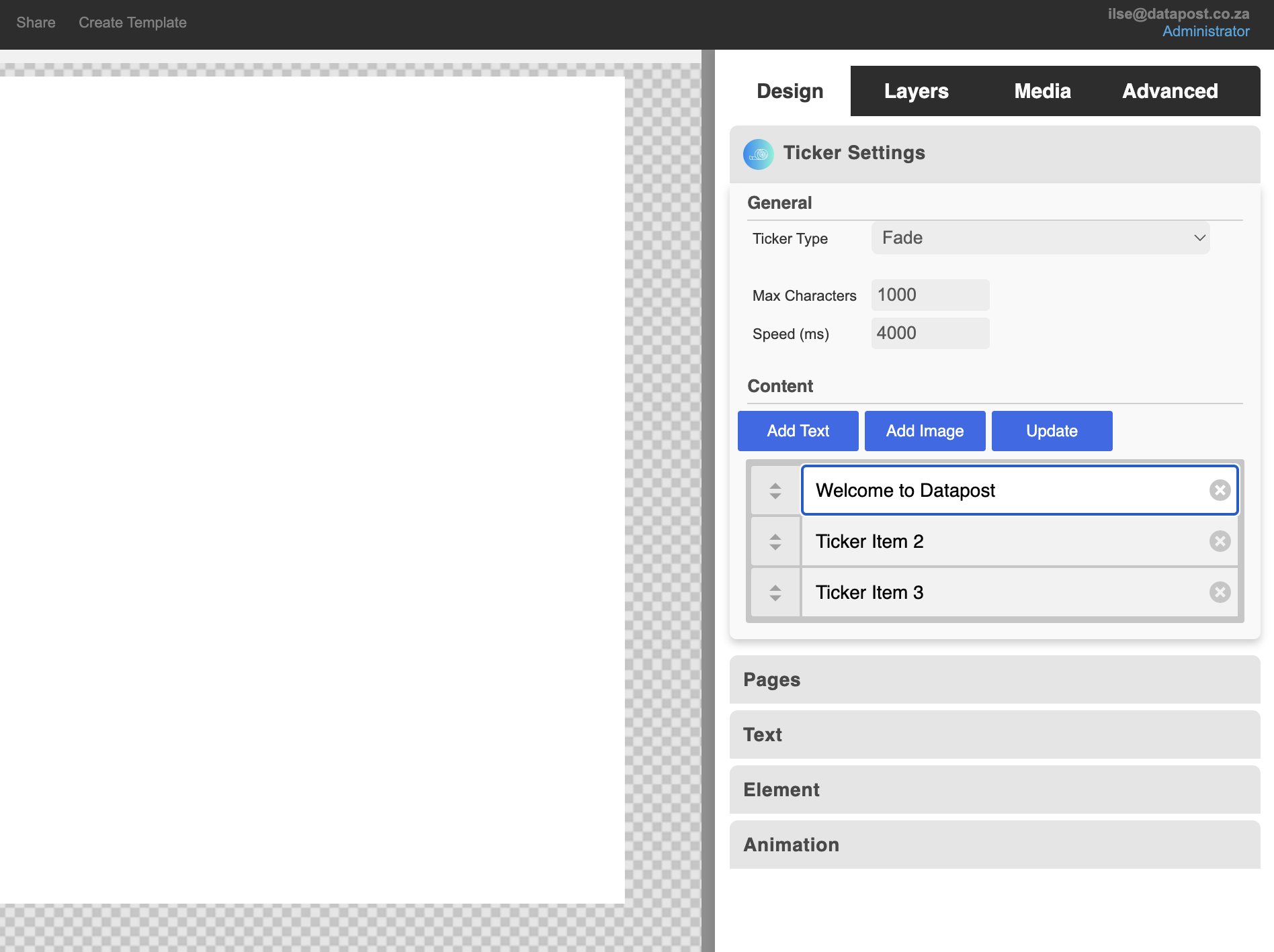
4. Type the required text in the Ticker Item box & click on the Update button.
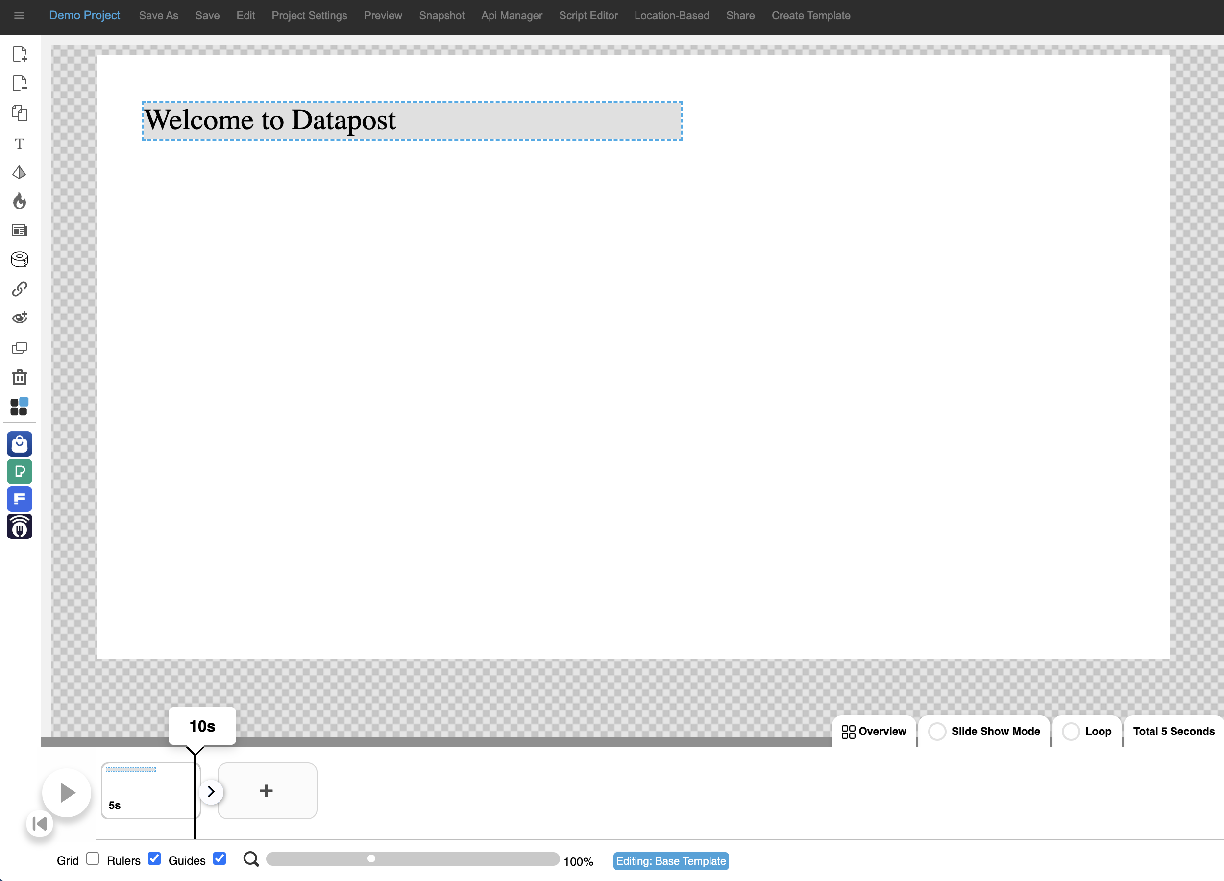
5. The text will update on the canvas. This can be done for all three ticker items.
Additional ticker items can be added by clicking on the Add Text button.
2.9 How to add navigation to an interactive project
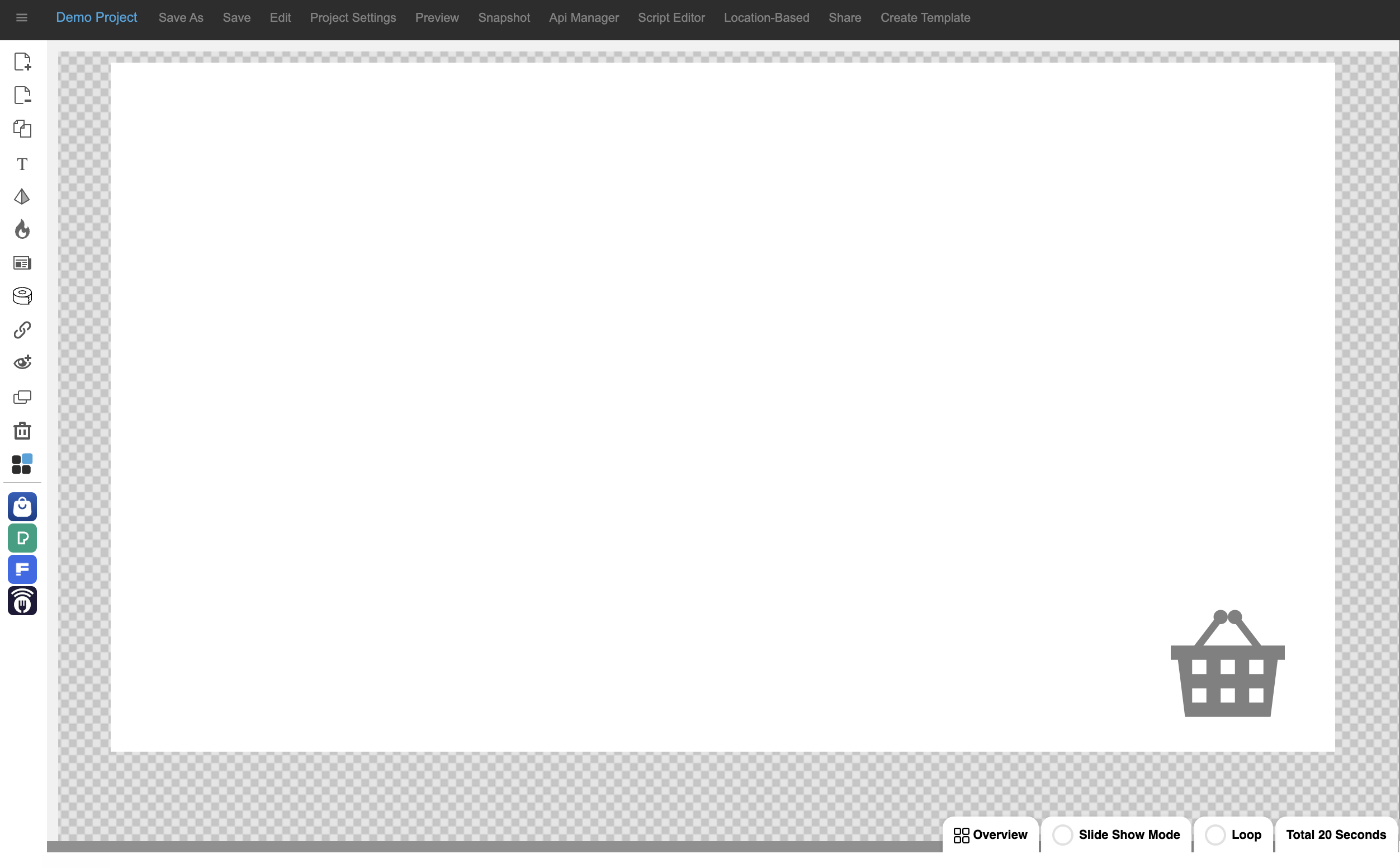
1. Click on the Interactive Mode icon in the menu panel on the left.
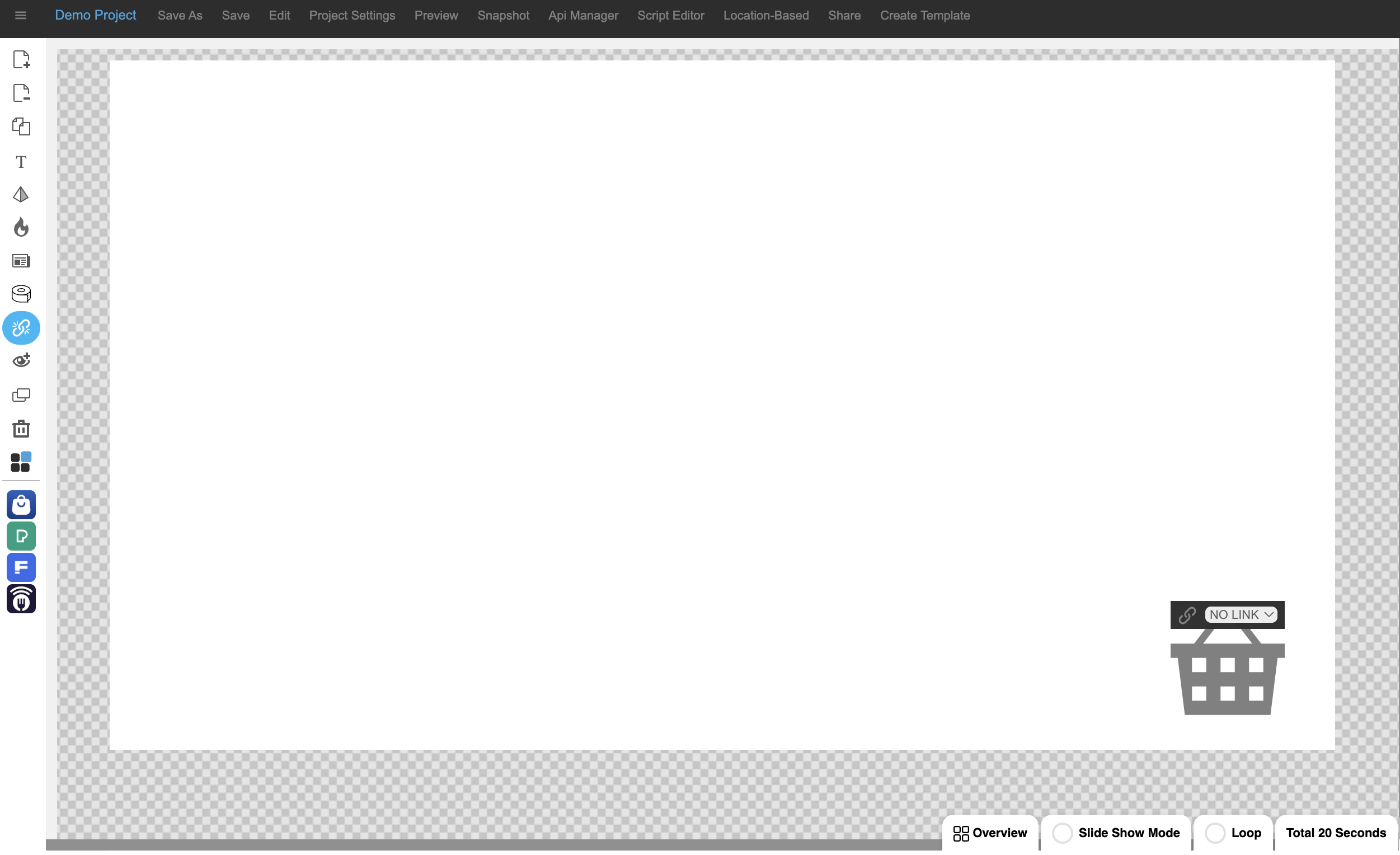
2. Interactive mode will activate. Select the page that you want the user to navigate to, when clicking on the shape, from the drop-down.
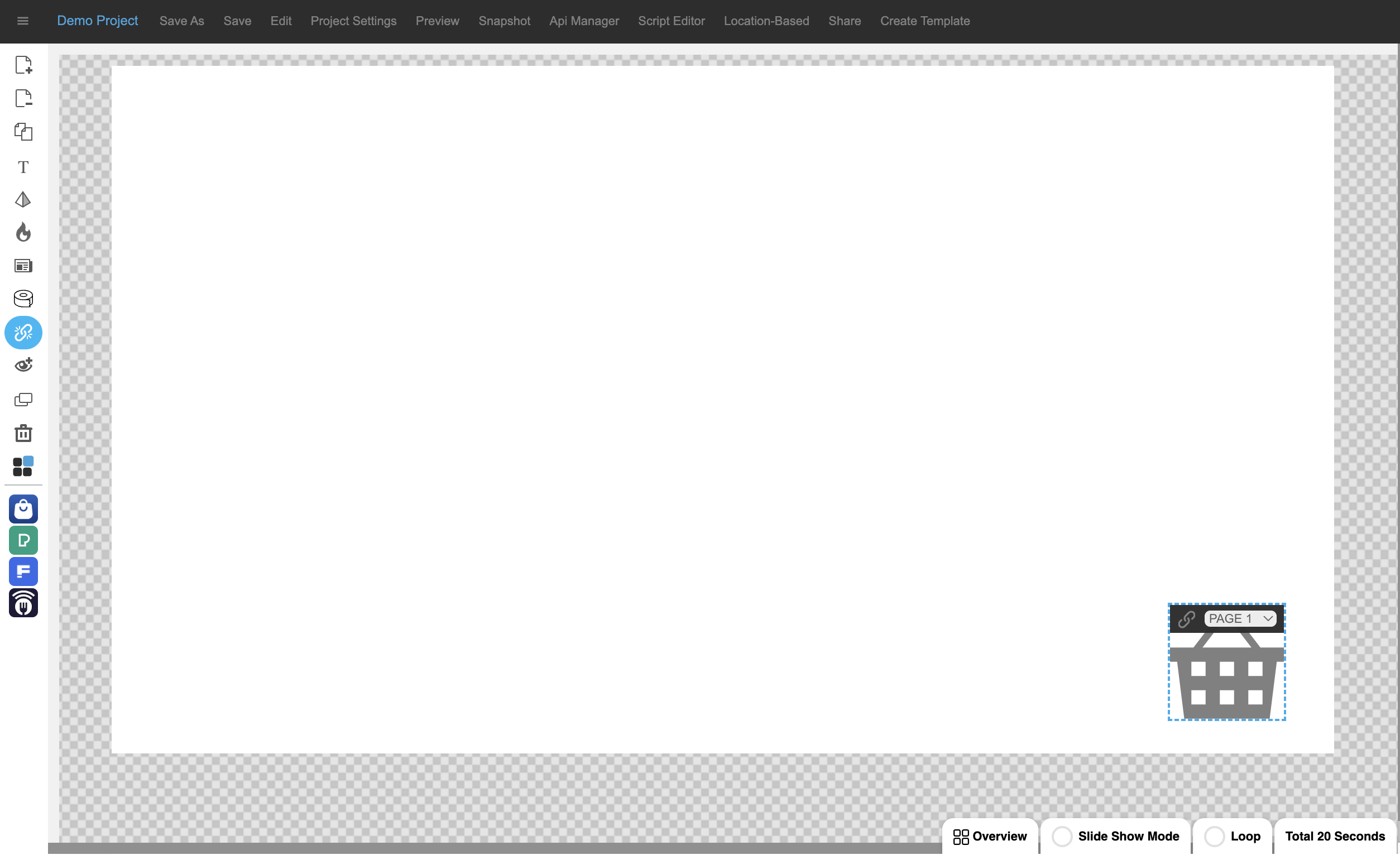
3. The selected page will update. Your navigation can be tested & confirmed by clicking through the project while the interactive mode is active. I.e. the icon is blue.
2.10 How to add an image modal
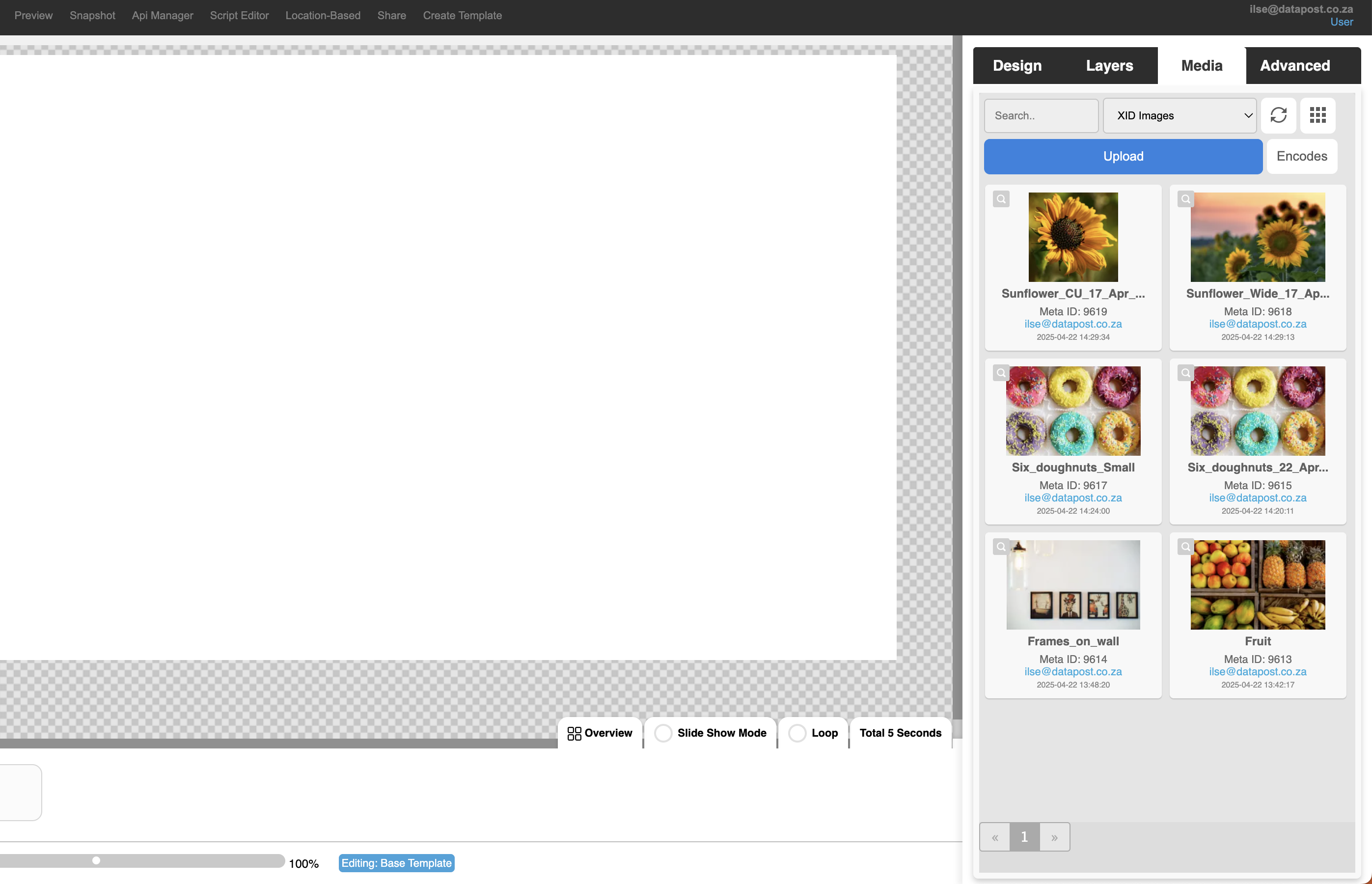
1. Insert a background image on the canvas by opening the Media panel and either double-clicking on the image or dragging and dropping it on the canvas.
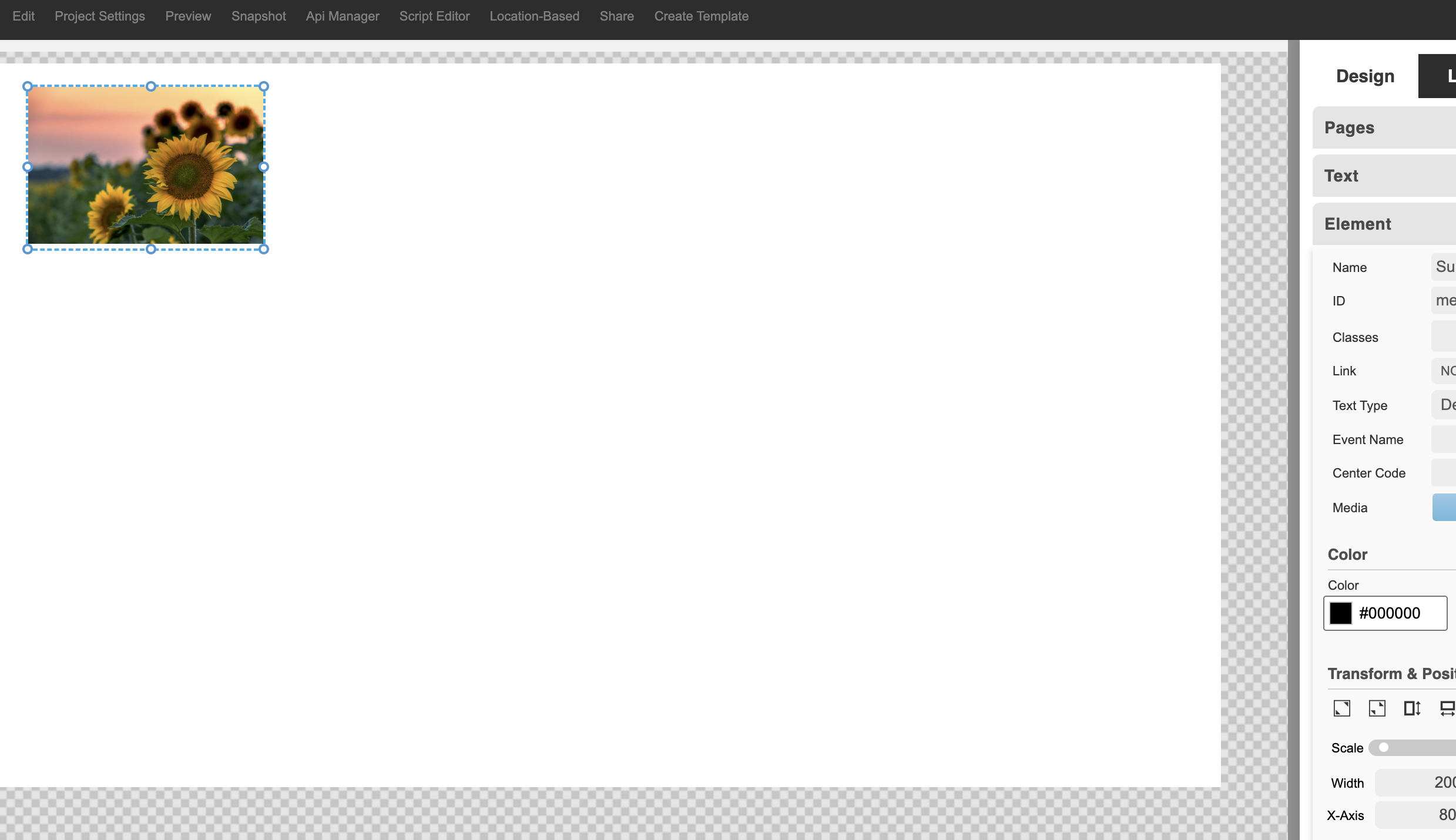
2. Highlight the image by clicking on it. Go to the Element panel under Design and click on the Stretch to Fill tool under Transform & Position.
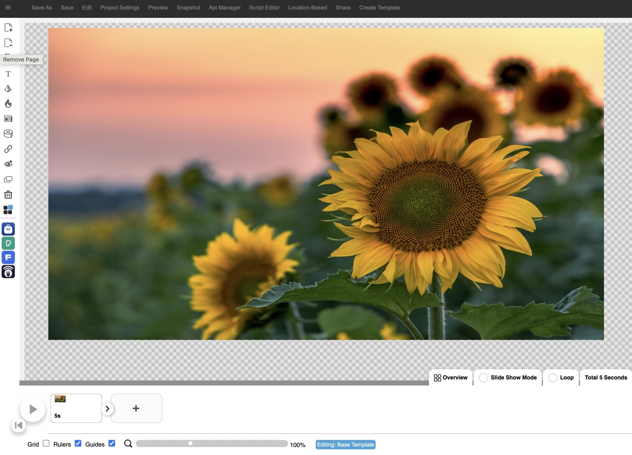
3. The background image will stretch to fill the canvas. Click on the Add Image Modal icon. A blue pop-up will ask you to add an image form the Media Library.
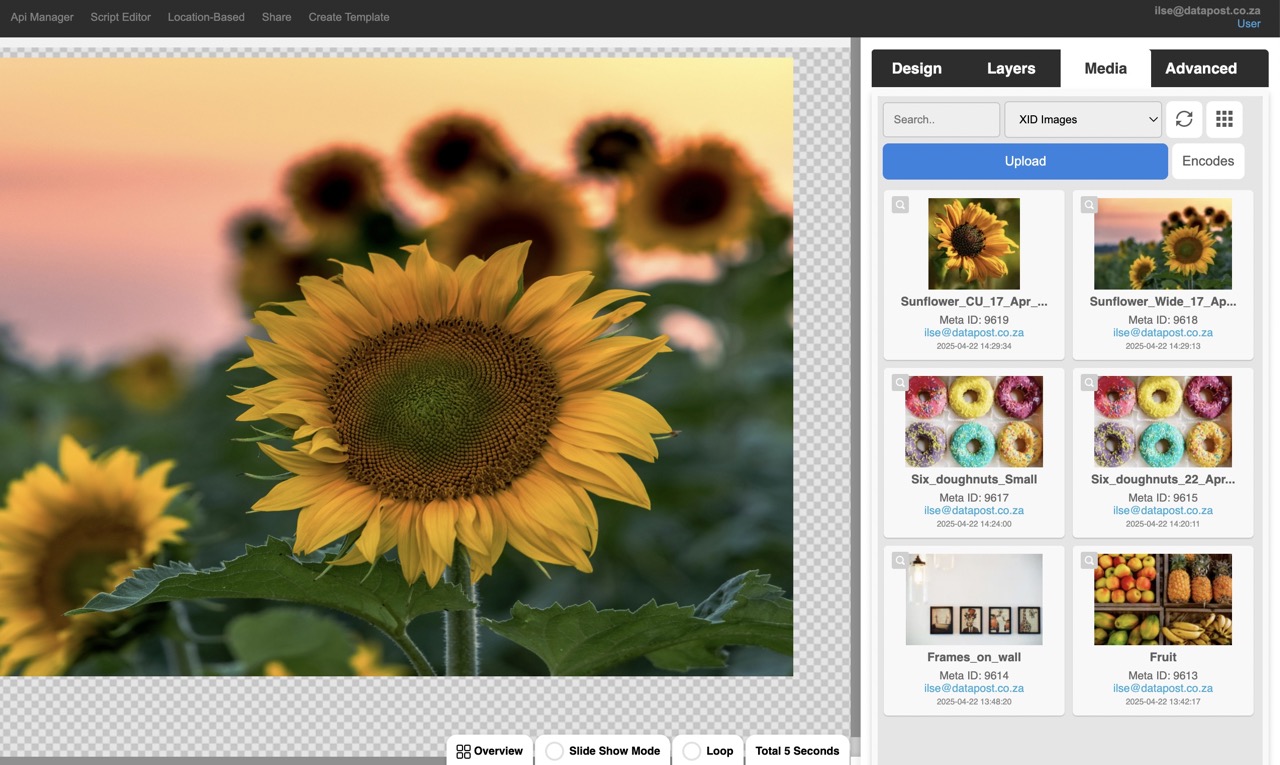
4. Click on the image that you want to use. The image modal panel will open.
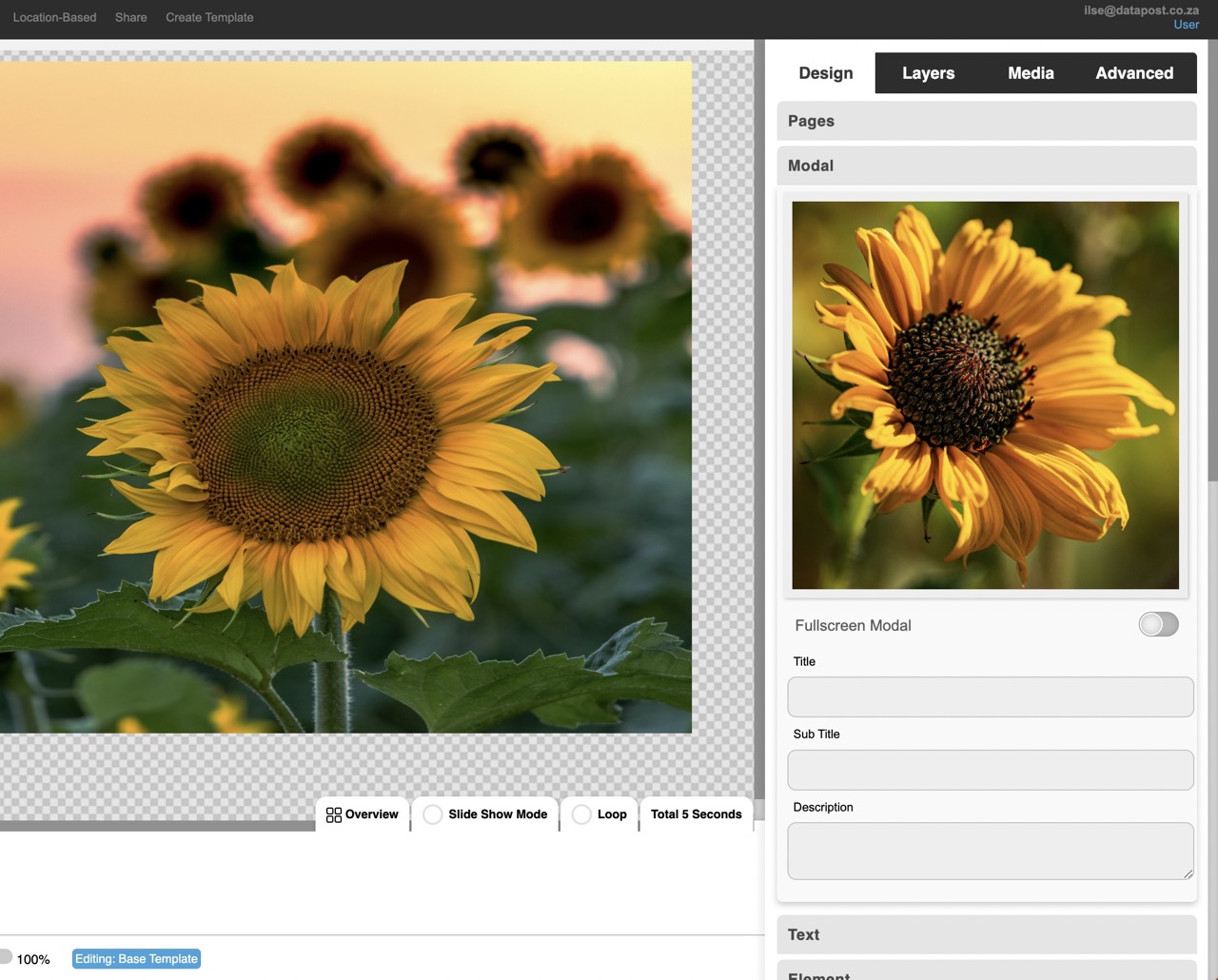
5. Make the modal full screen by toggling to the right. Give your modal a title, subtitle & description as required.
DUPLICATE ELEMENT
Click on the Duplicate Element icon to duplicate elements.
DELETE ELEMENT
Click on the Delete Element icon to delete elements.
XID TEMPLATE STORE
Visit the XID store to view and purchase a variety of available templates.
2.11 How to duplicate an element
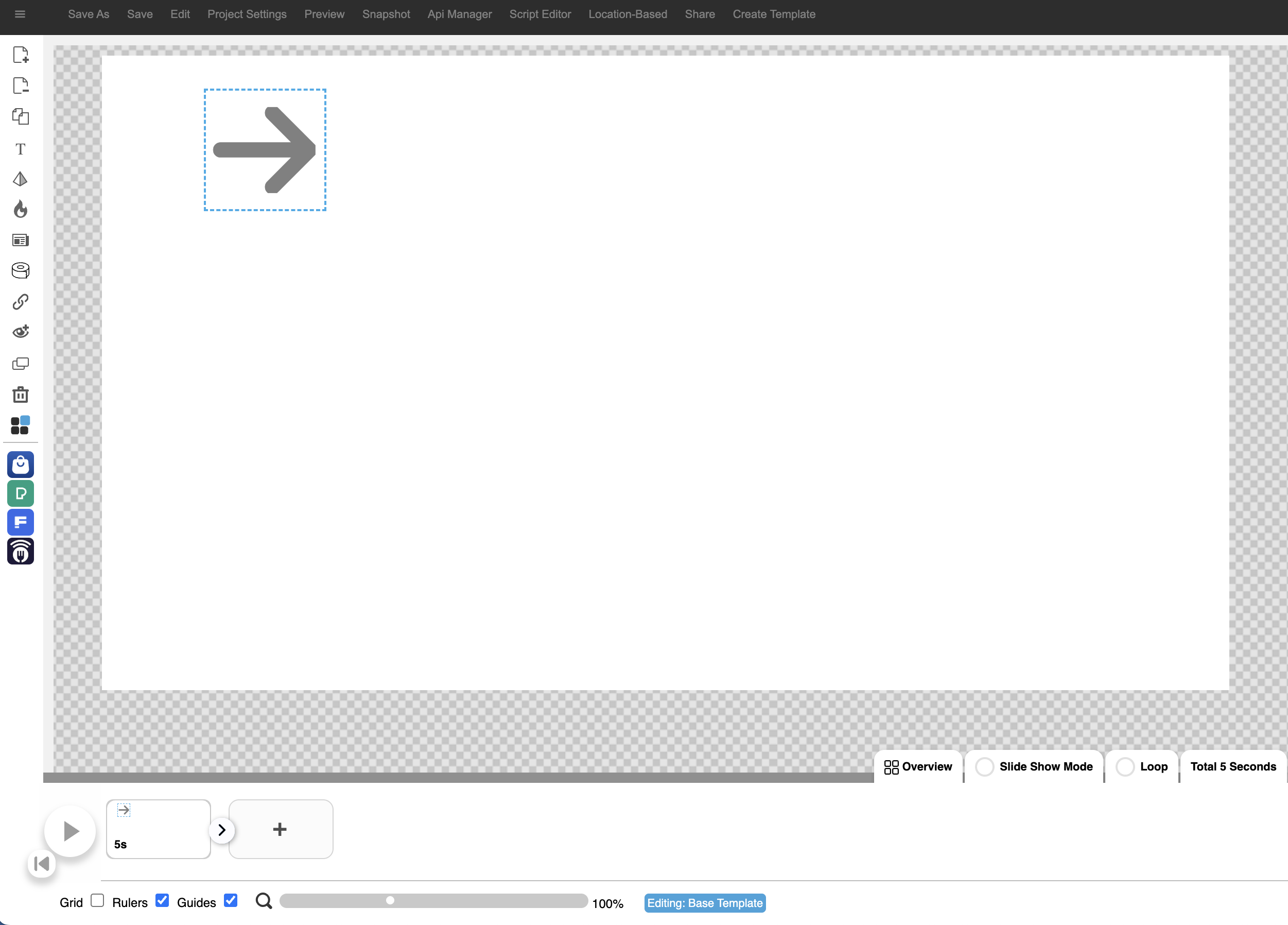
1. Click on the element that you want to duplicate, folowed by the Duplicate Element icon in the menu on the left.
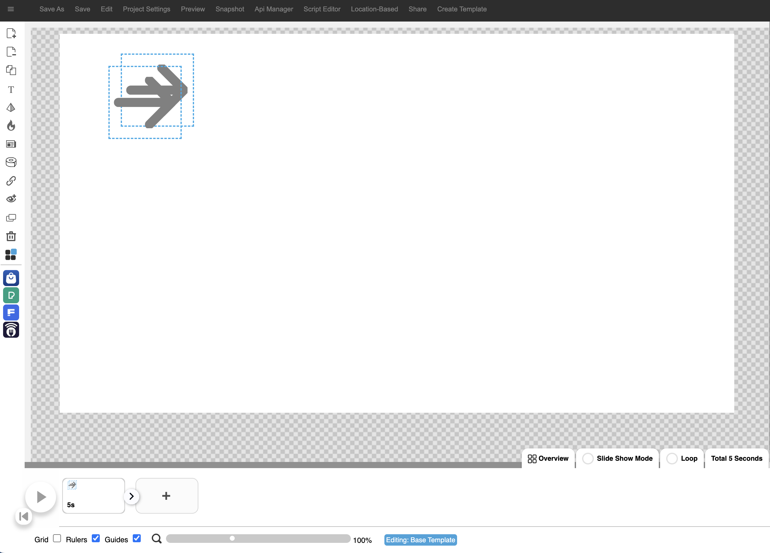
2. The element will duplicate.
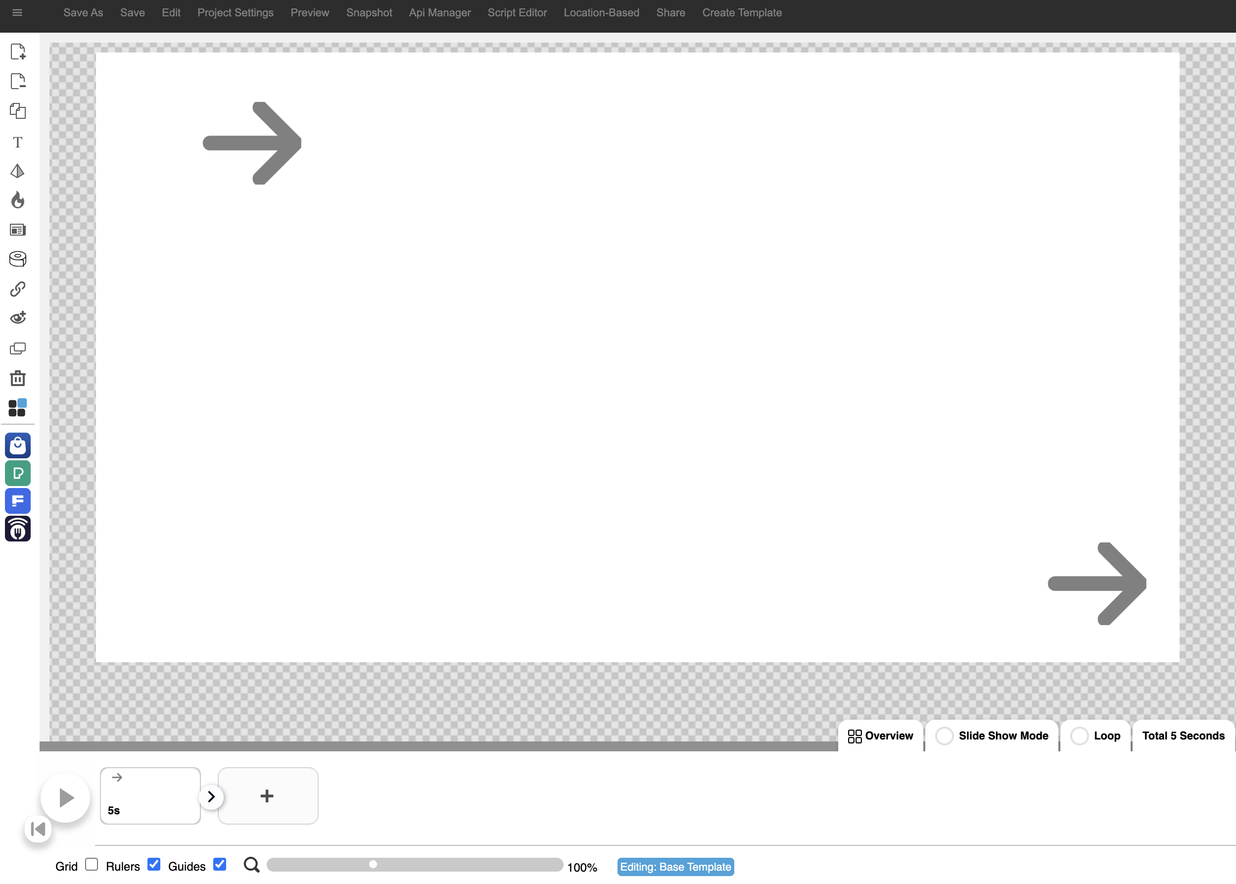
3. The element can now be moved to the required position on the canvas by dragging it.
2.12 How to delete an element
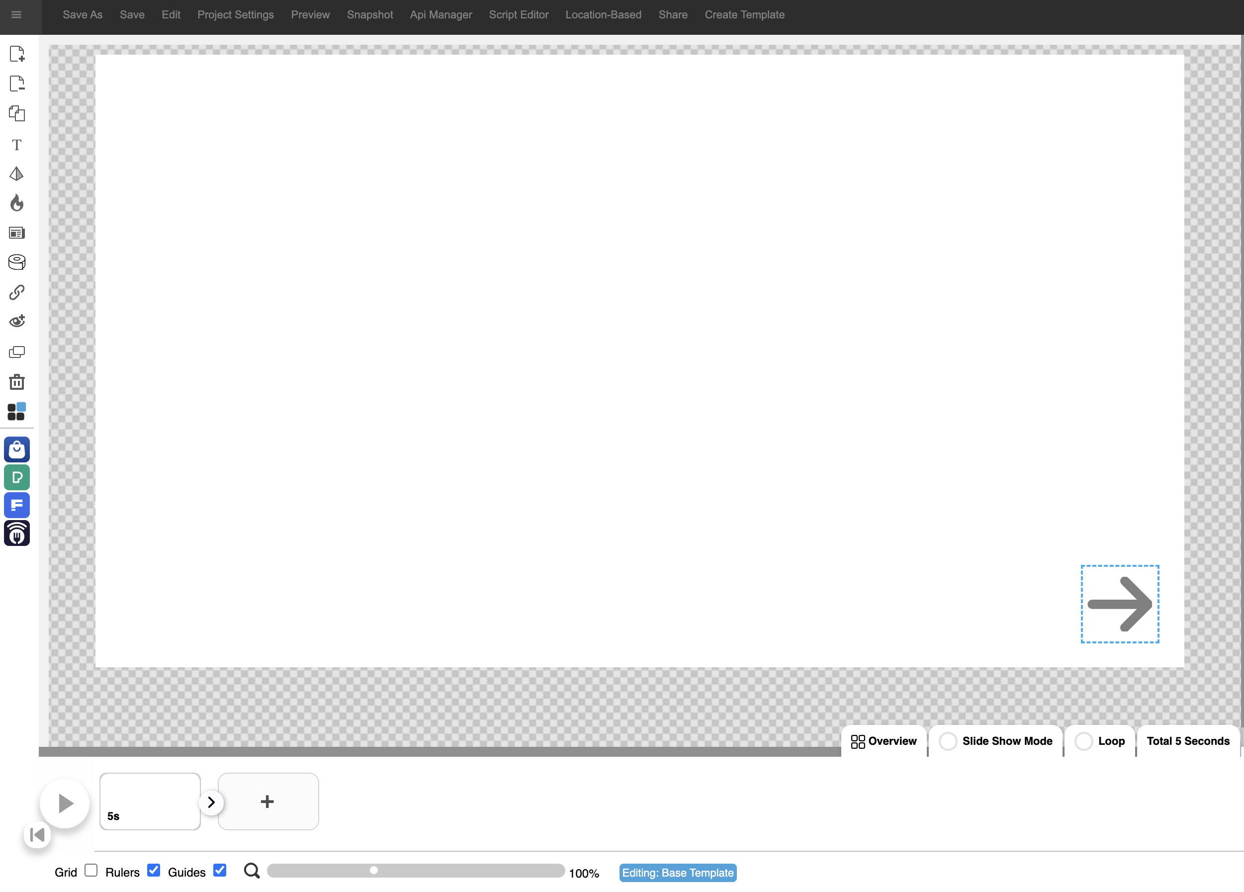
1. Highlight the element that you want to delete by clicking on it and then on the Delete Element icon.

2. The element will be removed from the canvas.
SITEDISH
The ultimate all-in-one bundle for food menus.
3. XID image and control panels
3.1 Design tab
The Design tab contains all functions related to the designing of your project. I.e. pages, fonts, elements & animations.
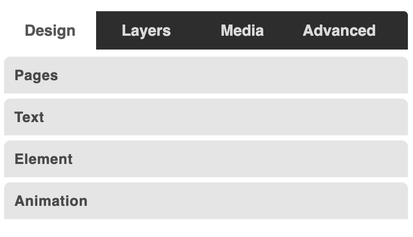
3.1.1 Page Control – Pages
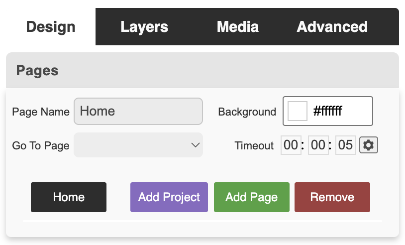
Page Name
Displays the name of the page that you are on.
Background
Change the background colour of the page that you are on by clicking on the block & selecting the colour you want your page to be from the colour picker.
Go To Page
This is where you select to which page your project must transition.
Timeout
This refers to the duration of the page you are on before it transitions to the next specified page.
Add Page & Remove
Add new pages & remove existing ones from this panel.
3.1.2 Text Control – Text
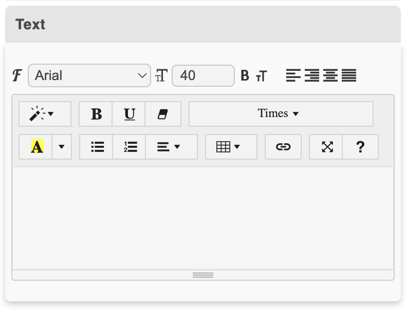
Text Tools
Font
Font Size
Text Aligment
Text Style
Bold & Underline
Remove Font Style
Background- & Foreground Colour
Unordered List
Ordered List
Table
Link
Full Screen
3.1.3 Element Control – Element
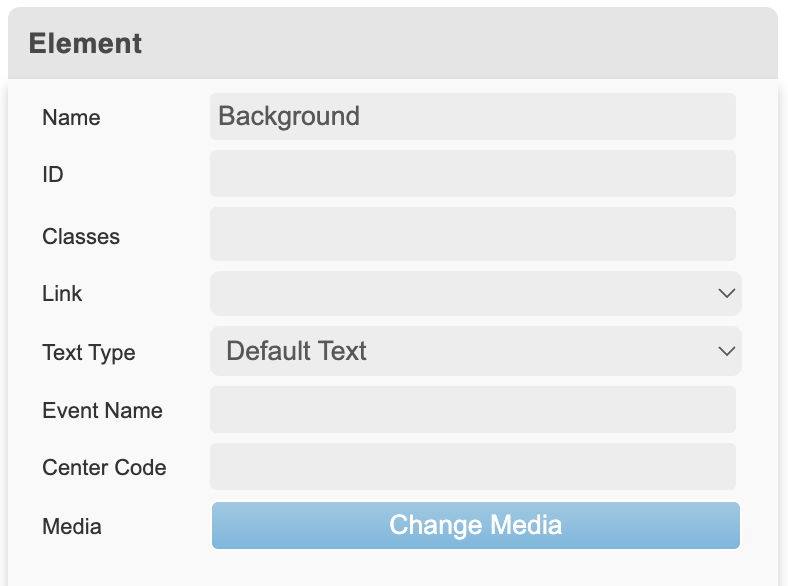
Name
Displays the name of the element.
Element Control – Color

Color
Change the colour of your element.
Background
Change the colour of your element’s background.
Border
Give your element a coloured border.
Element Control – Transform & Position
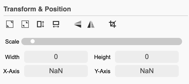
STRETCH TO FILL
When inserting a background image into your presentation, you will use Stretch To Fill to make the background full screen.
SHRINK ELEMENT
Shrink Element will do the opposite to Stretch to Fill. It will take a full screen image and shrink it down to its original size.
STRETCH TO FILL HEIGHT
Using Stretch To Fill Height will stretch the element to fill the height of your presentation canvas.
STRETCH TO FILL WIDTH
Using Stretch To Fill Width will stretch the element to fill the width of your presentation canvas.
FLIP VERTICALLY
Flip the element vertically by clicking on this icon.
How to stretch to fill an image
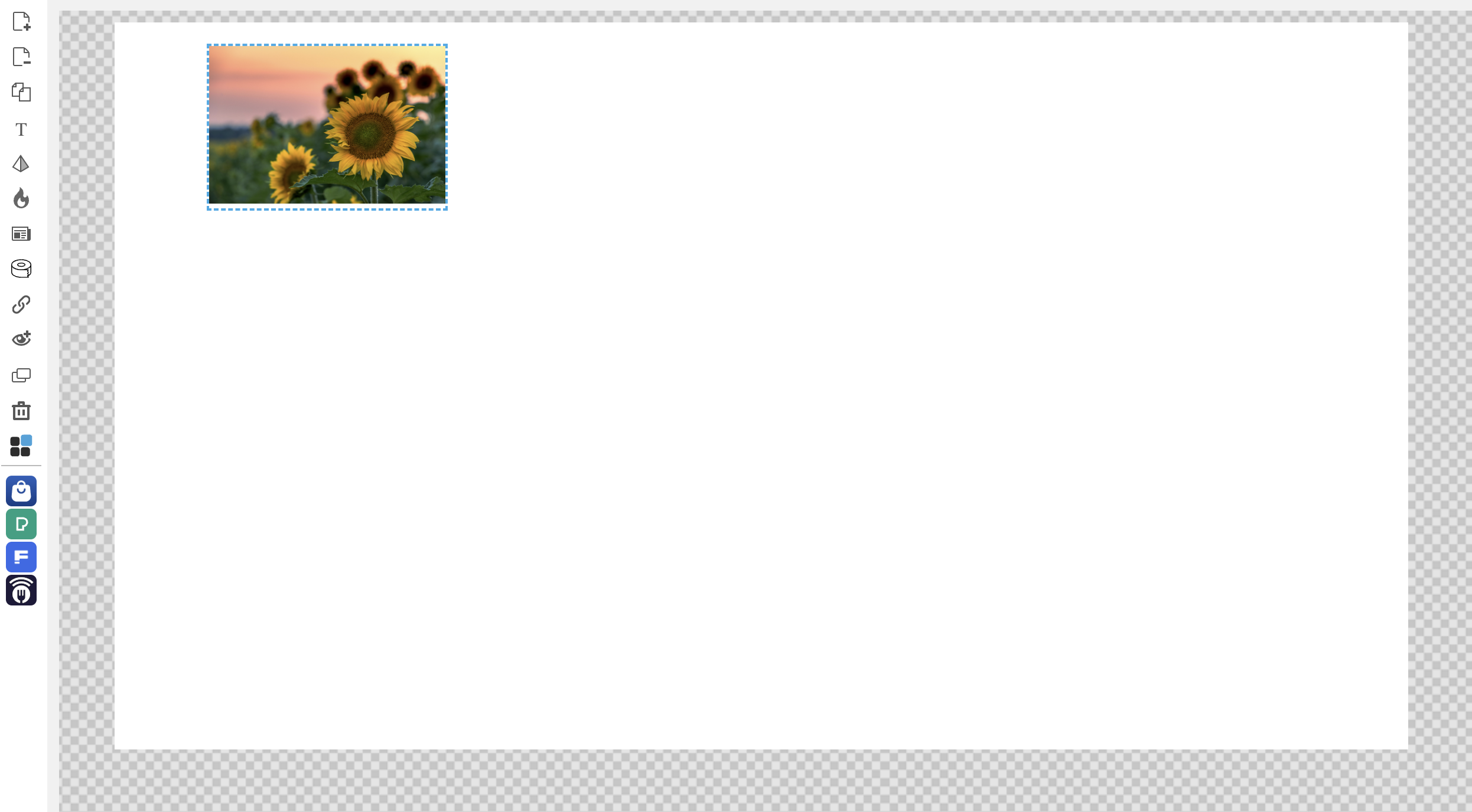
1. Highlight the image or video by clicking on it.
2. Click on the Stretch to Fill icon under Transform & Position under the Element tab.
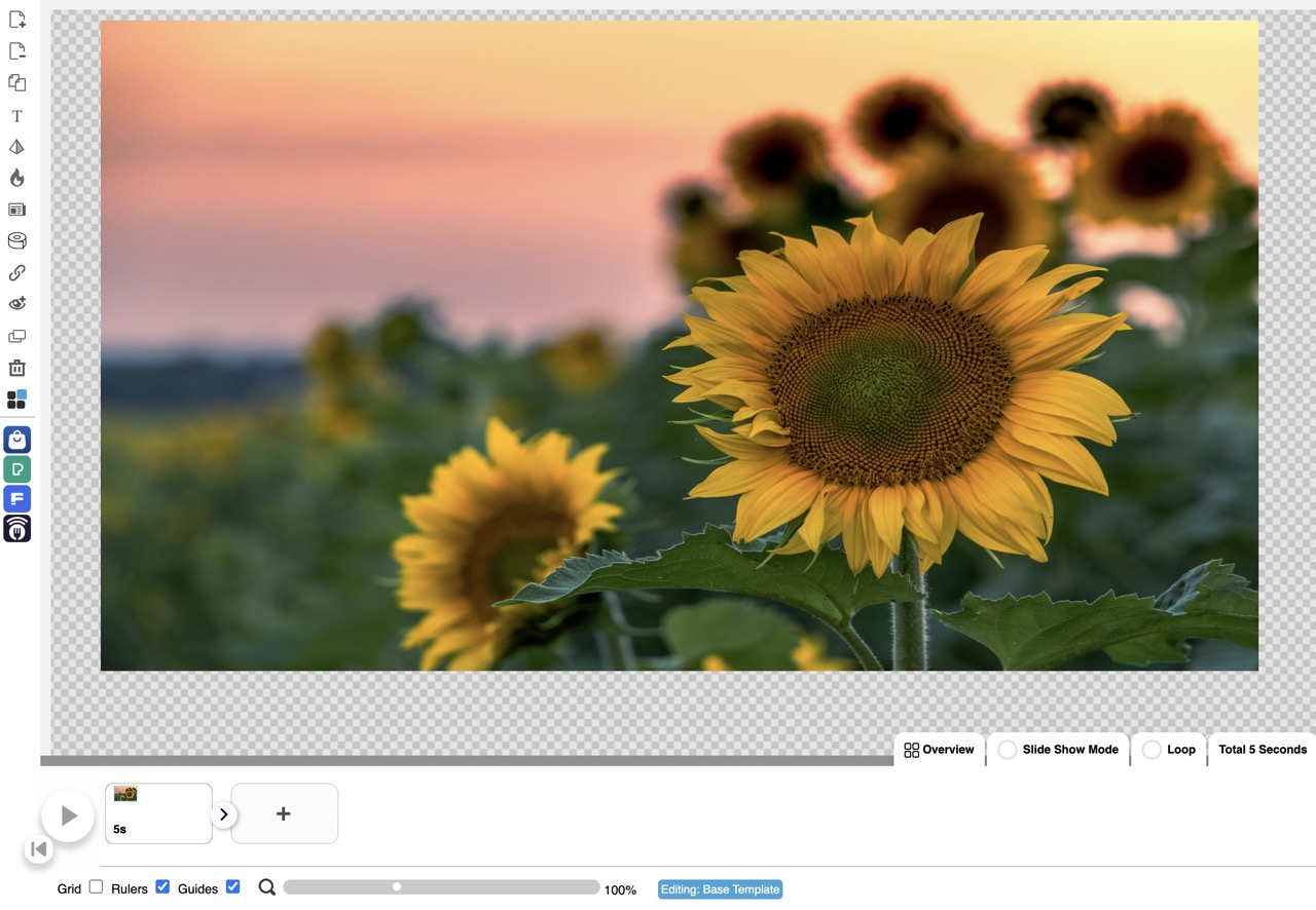
3. The image will stretch and fill the canvas.
How to shrink an element

1. Click on the image to highlight it.
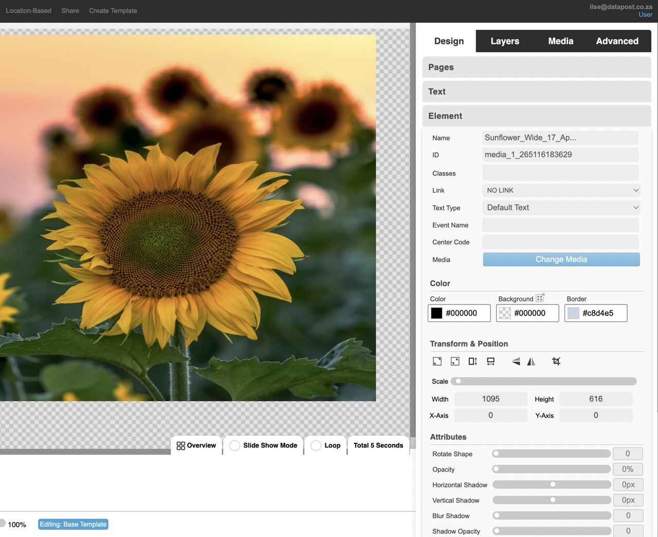
2. Click on the Shrink Element icon under Transform & Position under the Element tab.

3. The image will shrink back to its original size.
How to stretch to fill height
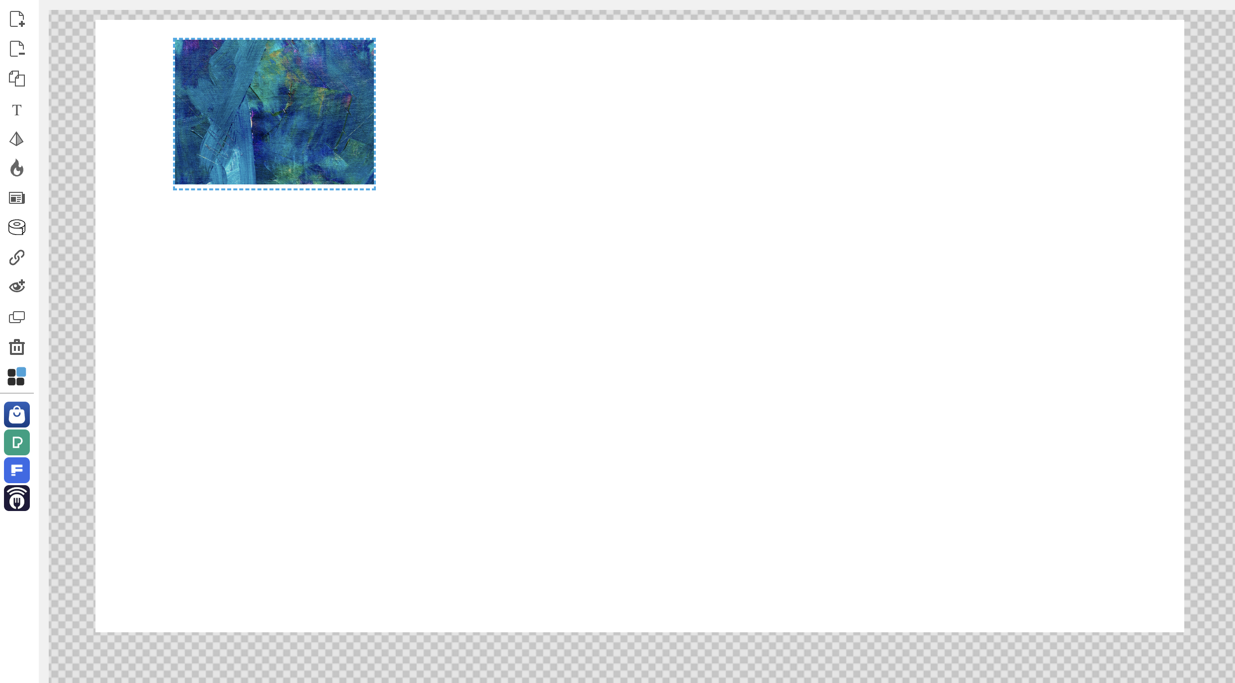
1. Highlight the element by clicking on it.
2. Click on the Stretch to Fill Height icon under Transform & Position under the Element tab.
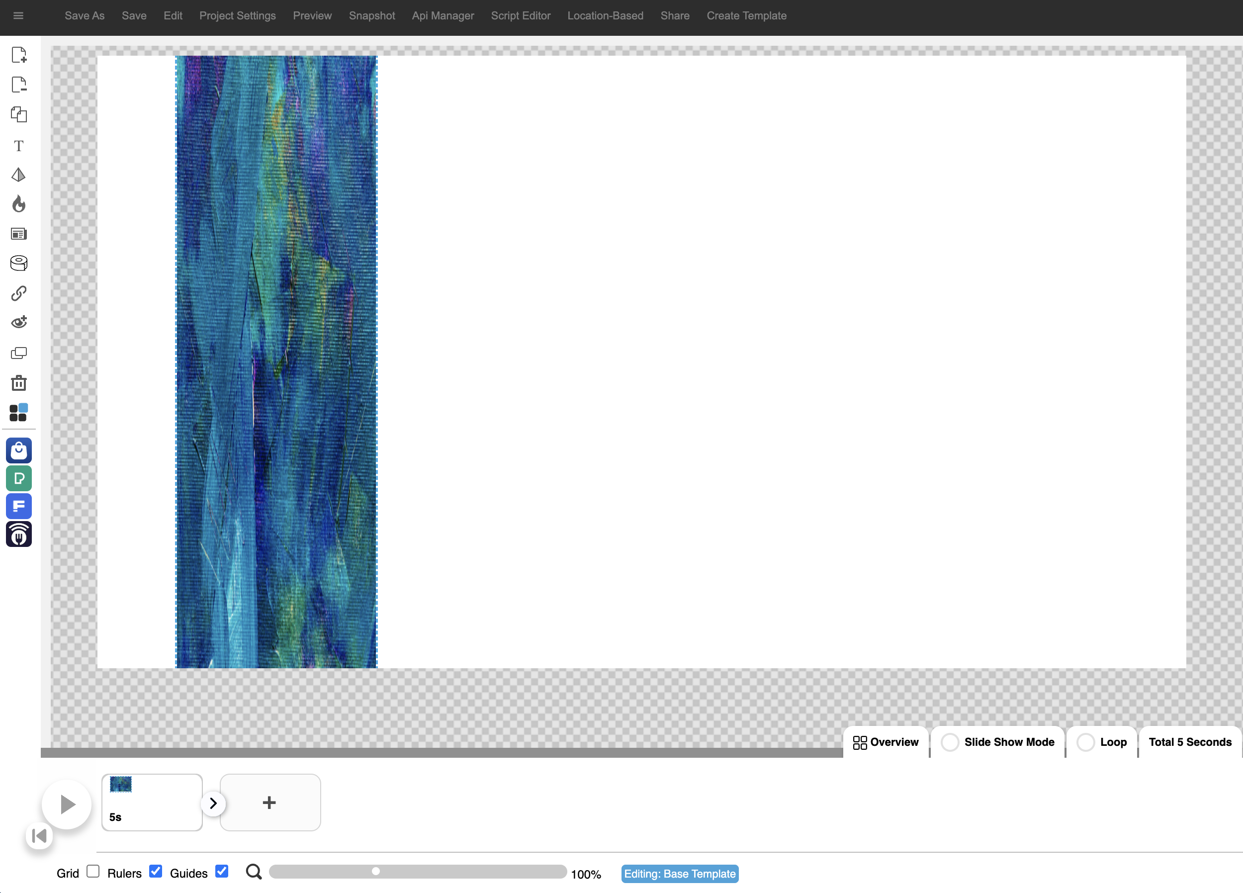
3. The element will stretch to fill the height of the canvas. It can be positioned as required by dragging and dropping it.
How to stretch to fill the width

1. Highlight the element by clicking on it.
2. Click on the Stretch to Fill Width icon under Transform & Position under the Element tab.
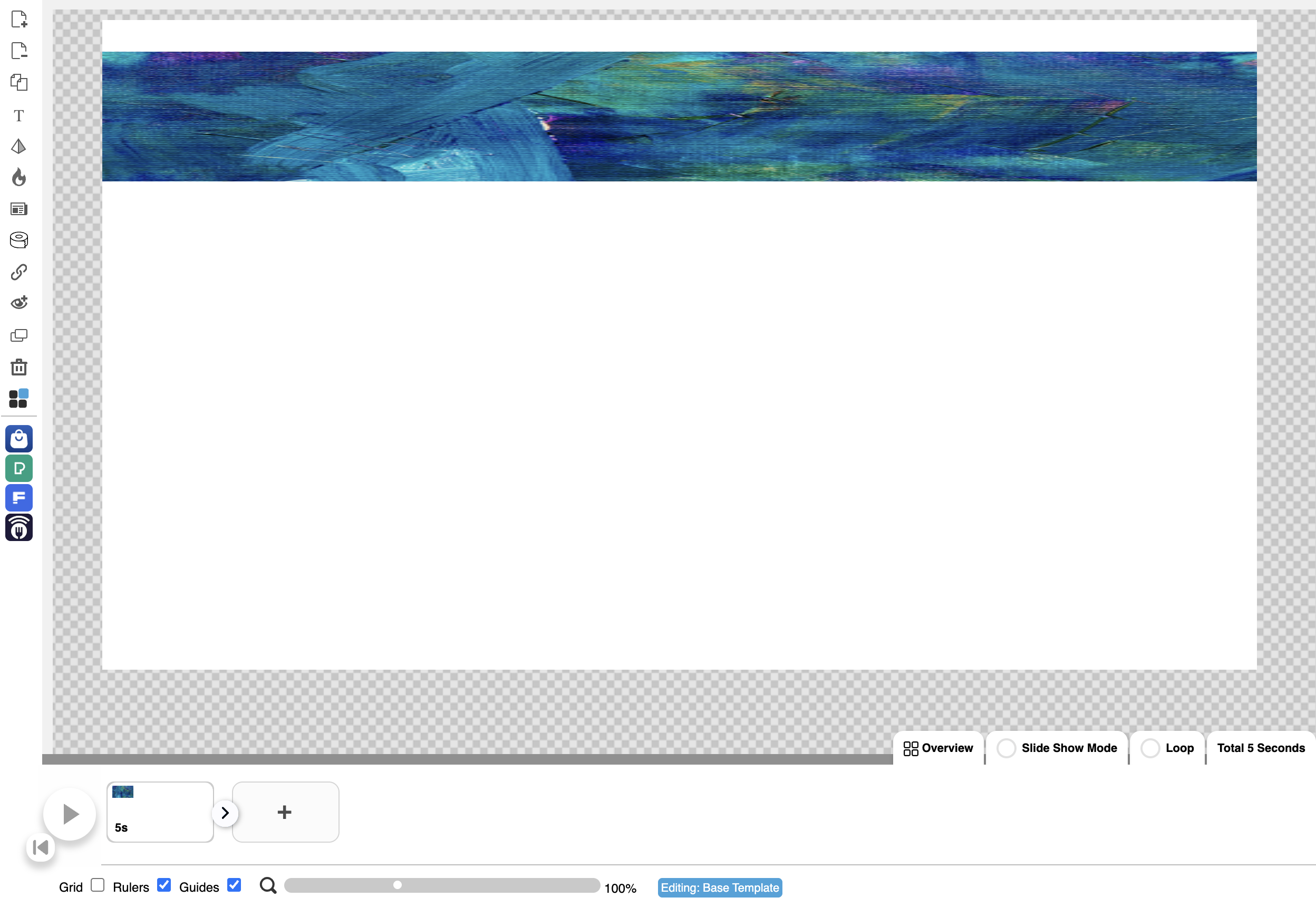
3. The element will stretch to fill the width of the canvas. It can be positioned as required by dragging and dropping it.
FLIP HORIZONTALLY
Flip the element horizontally by clicking on this icon.
CROP
Crop the image by clicking on this icon.
3.1.4 Attributes
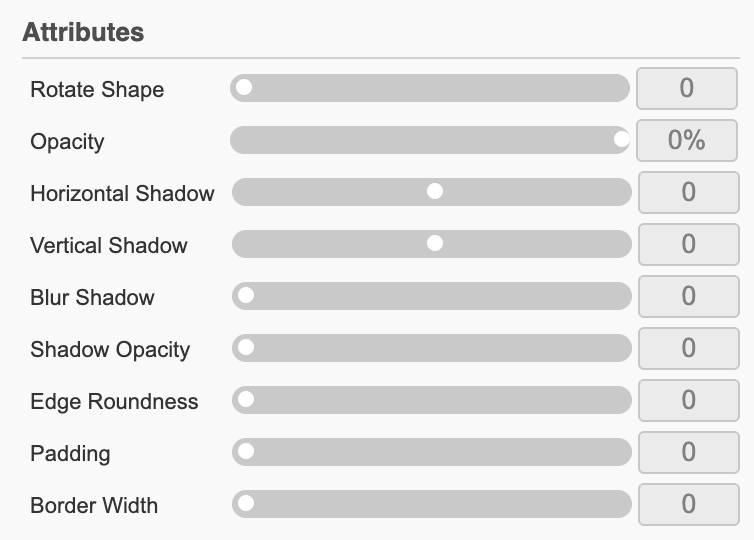
Rotate Shape – Rotate Shape is literally used to rotate elements.
Opacity – Control how transparent your elements are with the Opacity scrollbar.
Horizontal Shadow – Move the element’s shadow left or right using the Horizontal Shadow scrollbar.
Vertical Shadow – Move the element’s shadow up or down using the Vertical Shadow scrollbar.
Blur Shadow – Blur the element’s shadow using the Blur Shadow scrollbar.
Shadow Opacity – Increase or decrease the opacity of your element’s shadow by dragging the scrollbar left or right.
Edge Roundness – Set the roundness of the edges of your element’s background using the Edge Roundness scrollbar.
Padding – Add padding to your element’s background using the Padding scrollbar.
Border Width – Increase and decrease the width of the border around your element.
Advanced

Hide Overflow –
Image Fill –
3.1.5 Animation Control – Animations
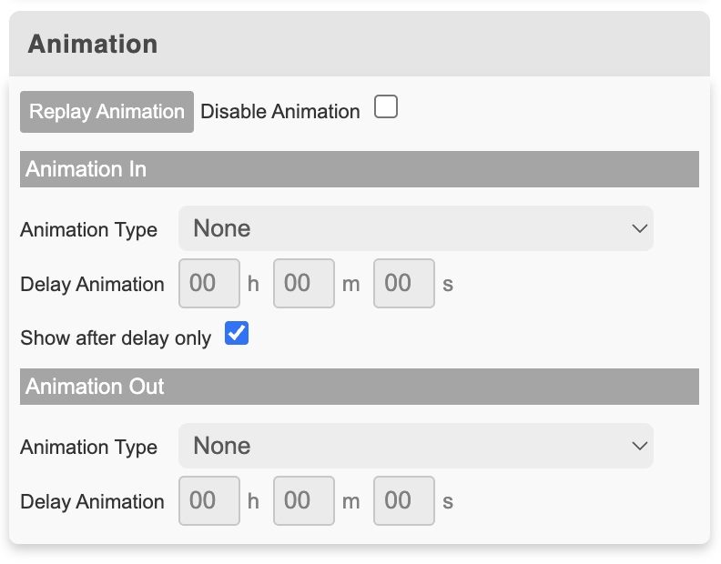
Animation In
Pulse
The element will pulse in and out.
Floating
The element will float up and down.
Tossing
The element will sway from side to side in its position.
Spin
The element will turn in circles.
Slide Down or Slide Up
The element will either slide into its position from the top down or the bottom up.
Slide Left or Slide Right
The element will slide into its position either from the right to the left or left to the right.
Pull Up or Pull Down
The element will reveal in its position by either pulling up or down.
Stretch Left or Stretch Right
The element will reveal in its position by either stretching to the left or the right. It is similar to pulling up or down, but just horizontally.
Slide Expand Up or Expand Up
The element will slide into position from the bottom and expand horizontally or vertically.
Fade In
The element will fade in after a set duration.
Expand Open
The element will expand outwards and contract to its original state after a set duration.
Big Entrance
The element expands outwards as it reveals.
Hatch
The element expands upwards in its position and wiggles from side to side.
Bounce
The element will bounce up and land in its position.
Animation Out
None
There is no animation out.
Fade Out
The element will fade out.
Pulse
Floating
Tossing
Spin
Fade Out Up
Fade Out Down
Fade Out Left
Fade Out Right
Slide Out Up
Slide Out Down
Slide Out Left
Slide Out Right
Zoom Out
Pull Up
Pull Down
Stretch Left
Stretch Right
Slide Expand Up
Expand Up
Expand Open
Big Entrance
Hatch
Bounce
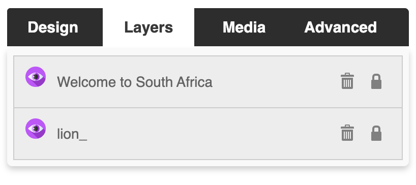
3.2 Layers tab
The Layers tab expands the different layers that make up the page that you are on.
Position elements in the foreground or background by dragging the layers up/down.
3.3 Media tab
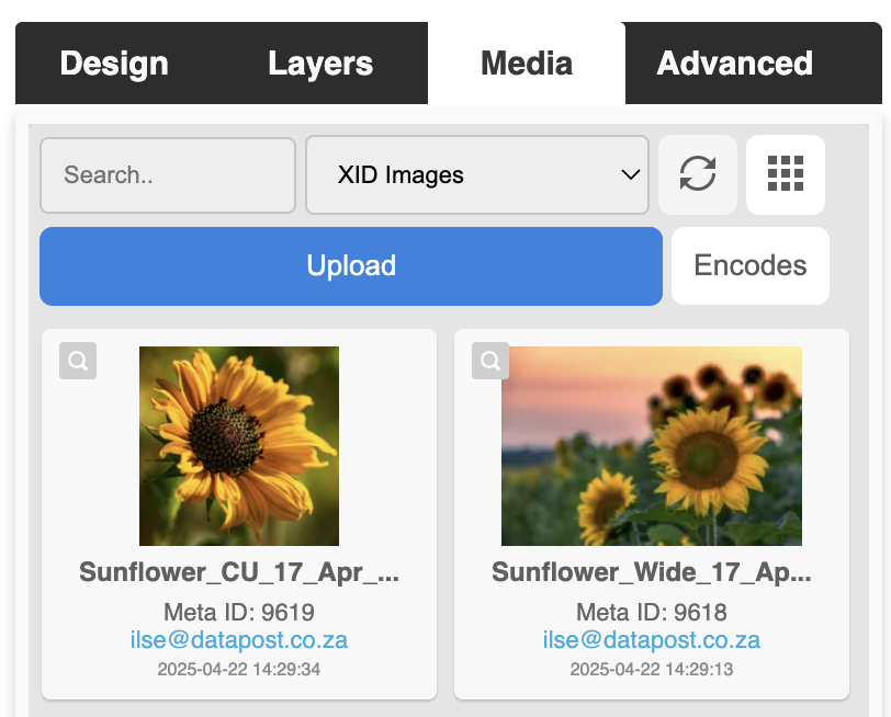
The Media tab is where you would upload videos and images to be used in your XID projects.
It is also where you would go to search content that has already been uploaded.
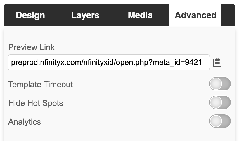
3.4 Advanced tab
The Advanced tab contains toggles where you can switch the Hot Spots and Template Timeout on & off.
